Henry
Yip
Henry Yip
Ditto Cafe Ditto Cafe Ditto Cafe Ditto Cafe Ditto Cafe Ditto Cafe Ditto Cafe Ditto Cafe Ditto Cafe Ditto Cafe Ditto Cafe Ditto Cafe
Ditto Cafe Ditto Cafe Ditto Cafe Ditto Cafe Ditto Cafe Ditto Cafe Ditto Cafe Ditto Cafe Ditto Cafe Ditto Cafe Ditto Cafe Ditto Cafe
2025
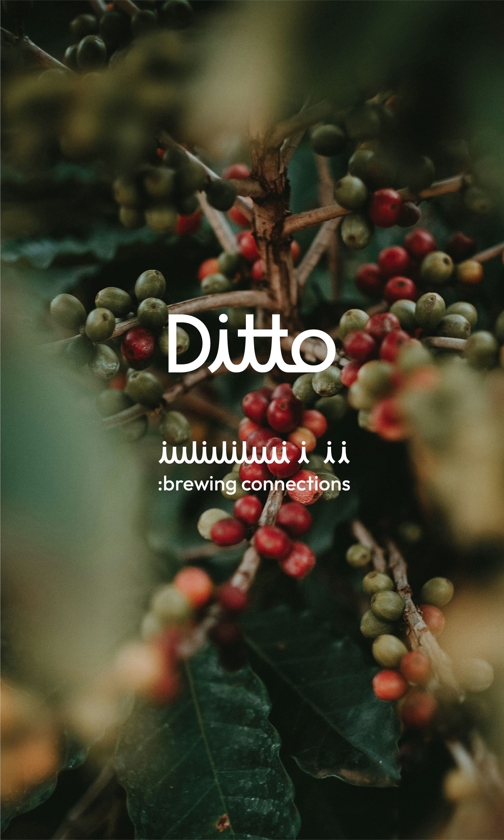
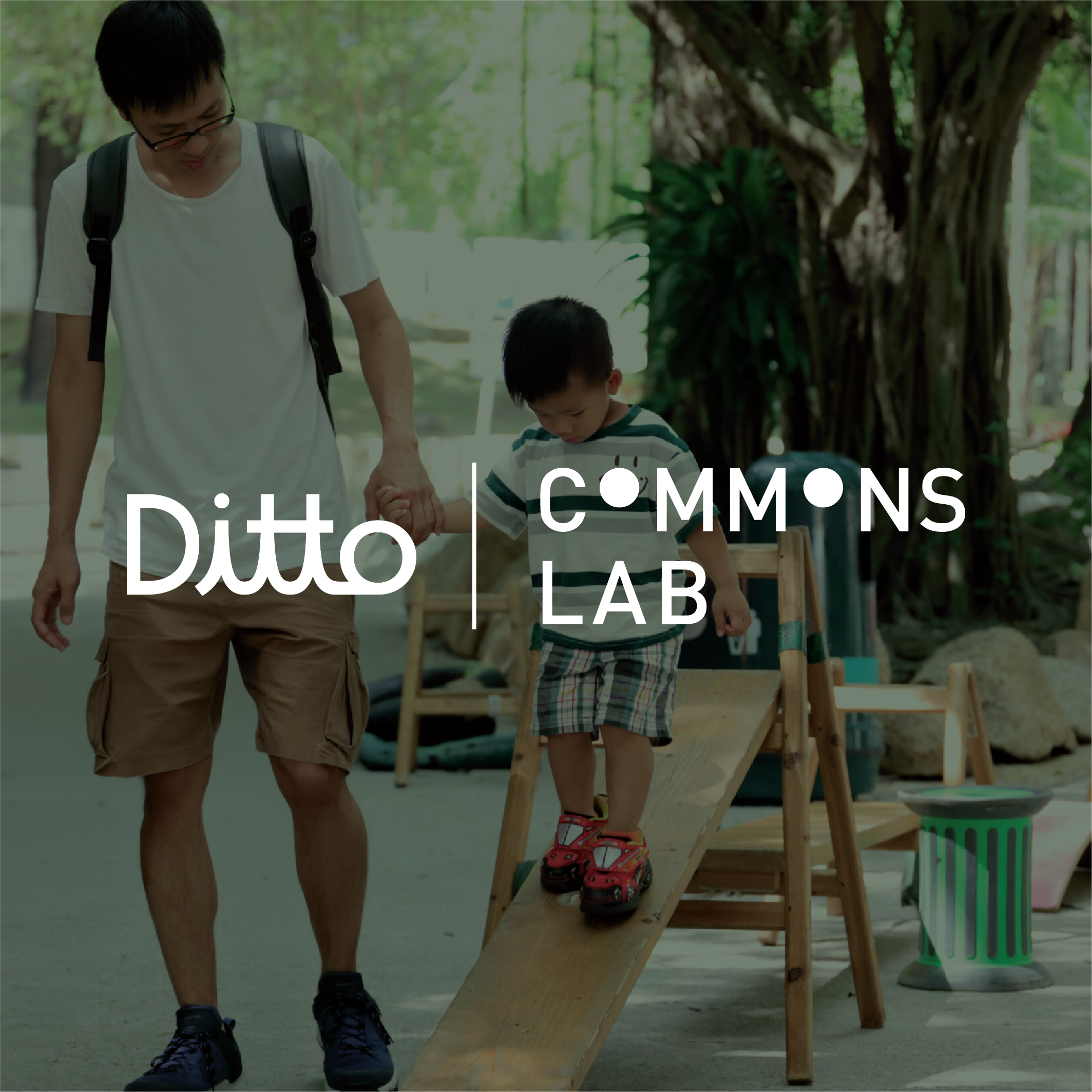
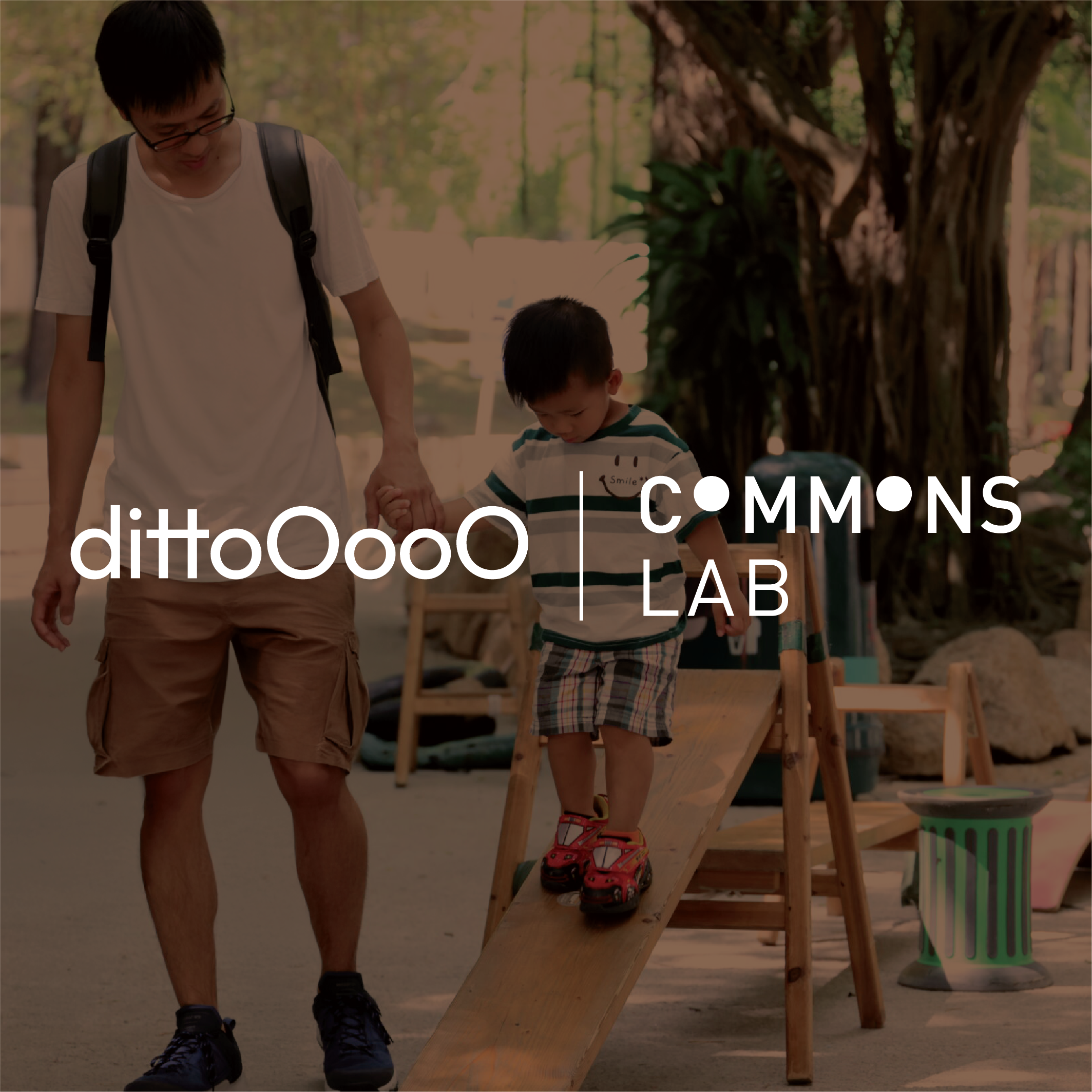
Ditto is nestled within the Commons Lab, the vibrant new home of the Architecture Commons and the Neighbourhood Innovation Lab. More than just a coffee shop, Ditto is a lively hub for food and beverage experimentation, inviting visitors to explore innovative culinary creations. It serves as a central gathering place for the South Lane community, fostering engagement, conversation, and meaningful connections among people from all walks of life. Here, individuals can come together to exchange ideas, collaborate on projects, and discover exciting possibilities that emerge from shared experiences.
At Ditto, the atmosphere is warm and welcoming, characterized by a friendly tone and an approachable personality that invites everyone to step inside. The space is designed to be dynamic and adaptive, constantly evolving to embrace new adventures. Whether it’s experimenting with unique flavors, hosting community events, or facilitating workshops, Ditto encourages a spirit of exploration and continuous learning. It’s a place where creativity flourishes, and everyone is invited to join in the journey of discovery.
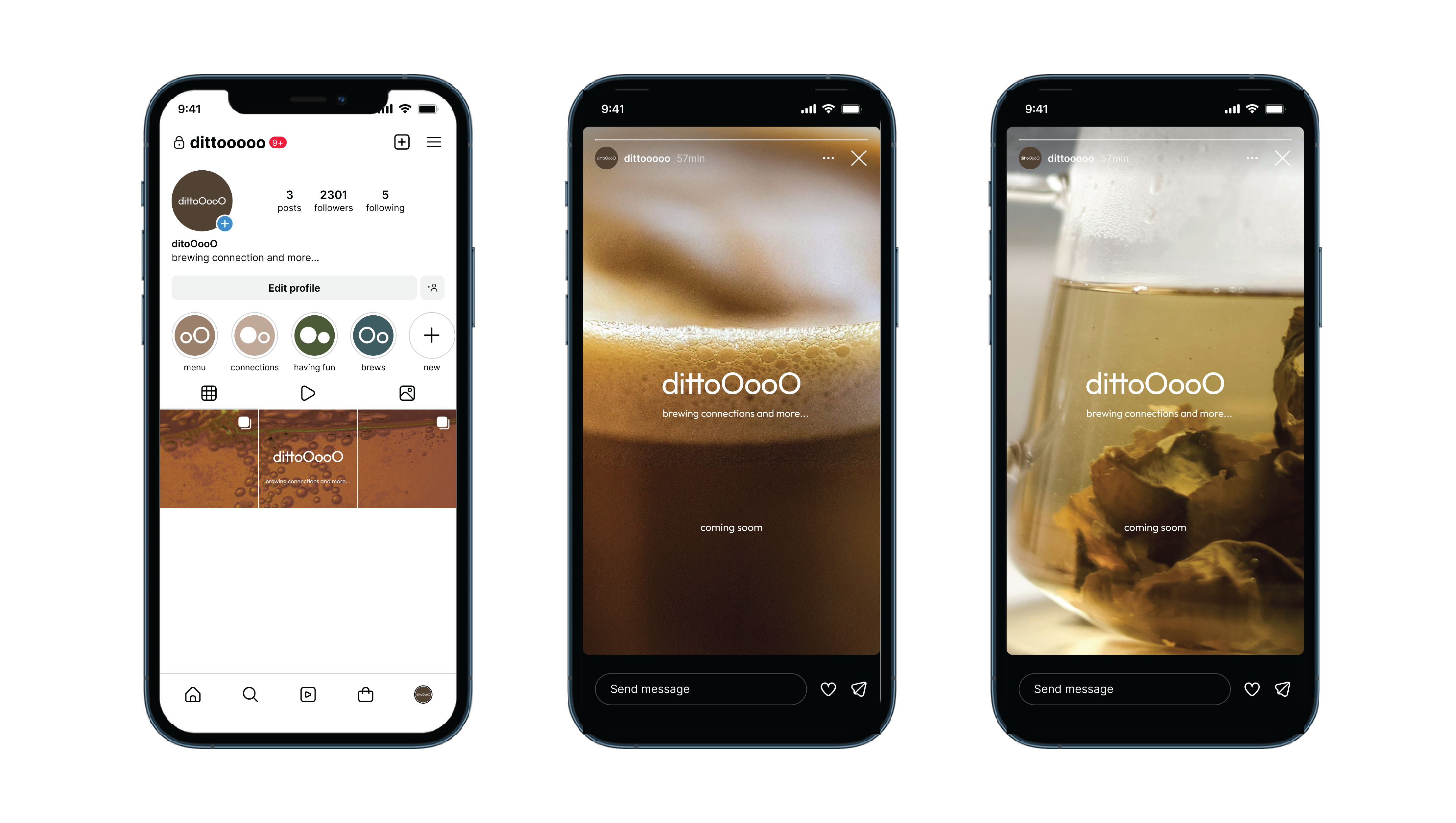
Welcome to the ditto, where we are brewing connections.
At Ditto, the atmosphere is warm and welcoming, characterized by a friendly tone and an approachable personality that invites everyone to step inside. The space is designed to be dynamic and adaptive, constantly evolving to embrace new adventures. Whether it’s experimenting with unique flavors, hosting community events, or facilitating workshops, Ditto encourages a spirit of exploration and continuous learning. It’s a place where creativity flourishes, and everyone is invited to join in the journey of discovery.
Welcome to the ditto, where we are brewing connections.

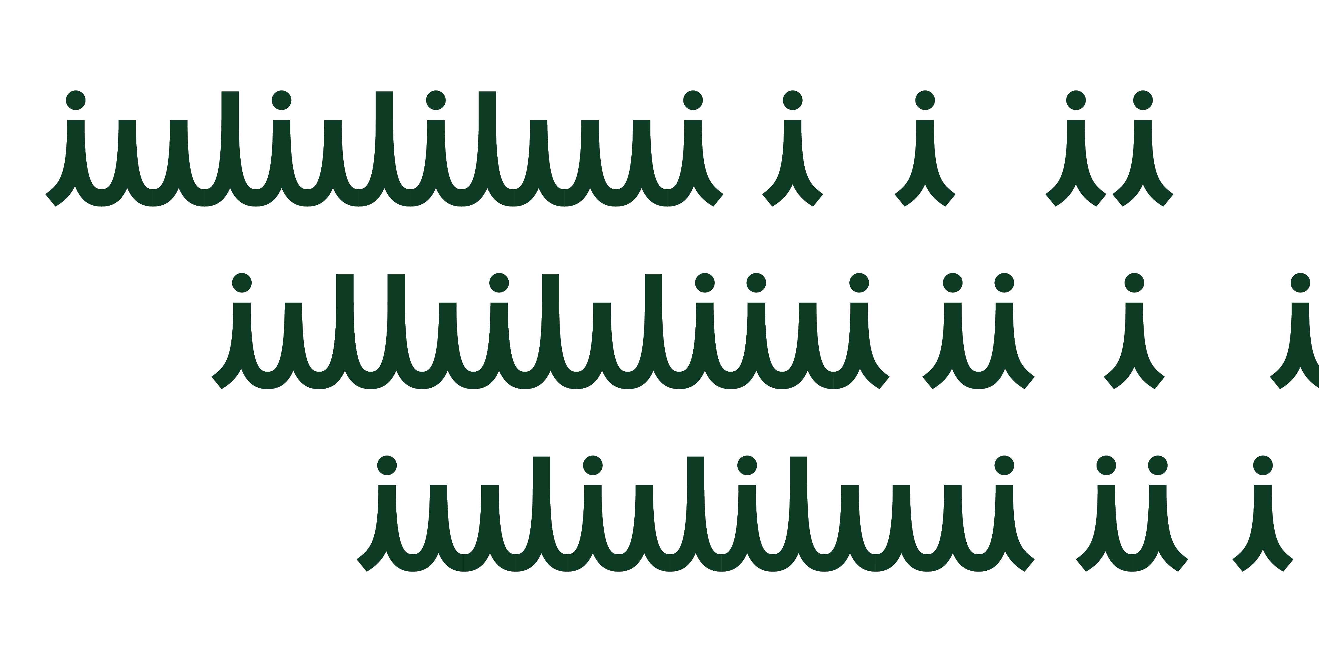


The first concept centers on people and connection, highlighting the essence of community within the Ditto brand. This approach emphasizes the importance of fostering relationships and interactions among individuals. By placing people at the heart of its identity, Ditto positions itself as a welcoming space for collaboration and engagement.
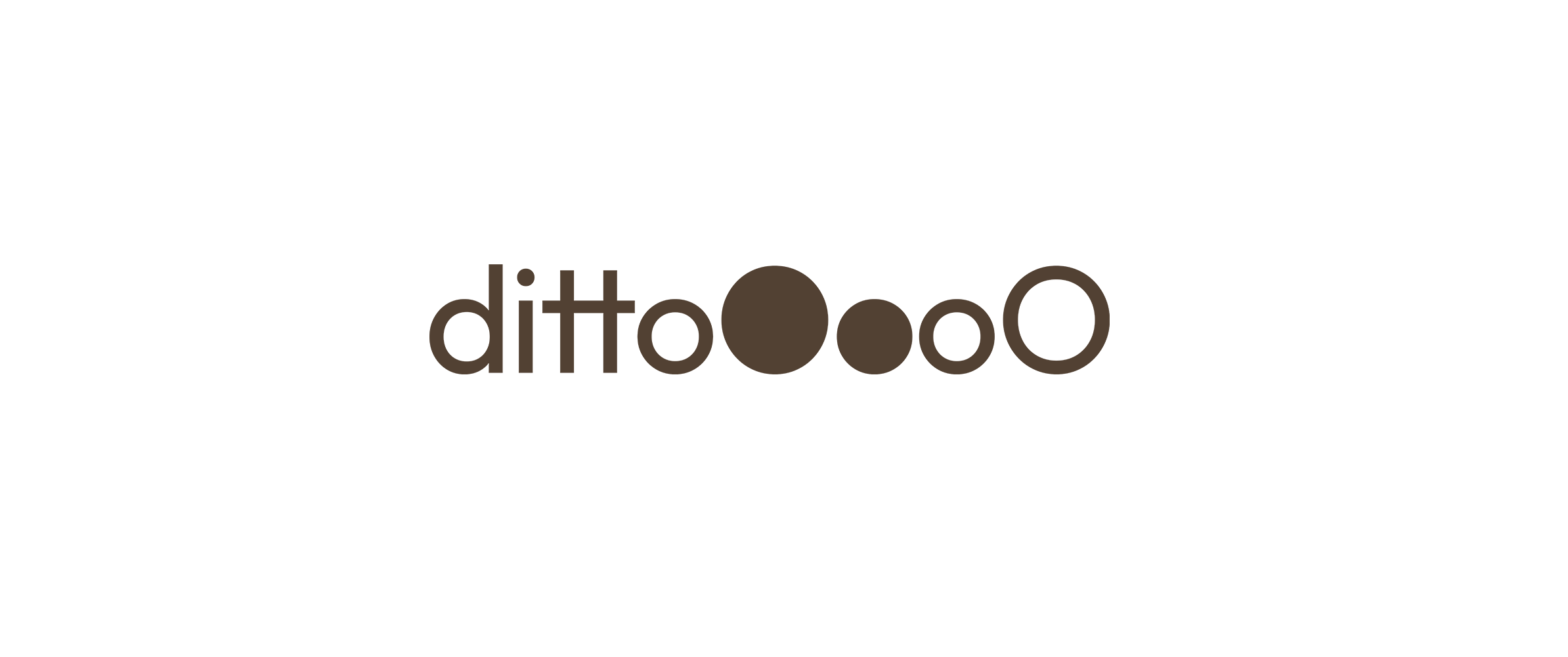
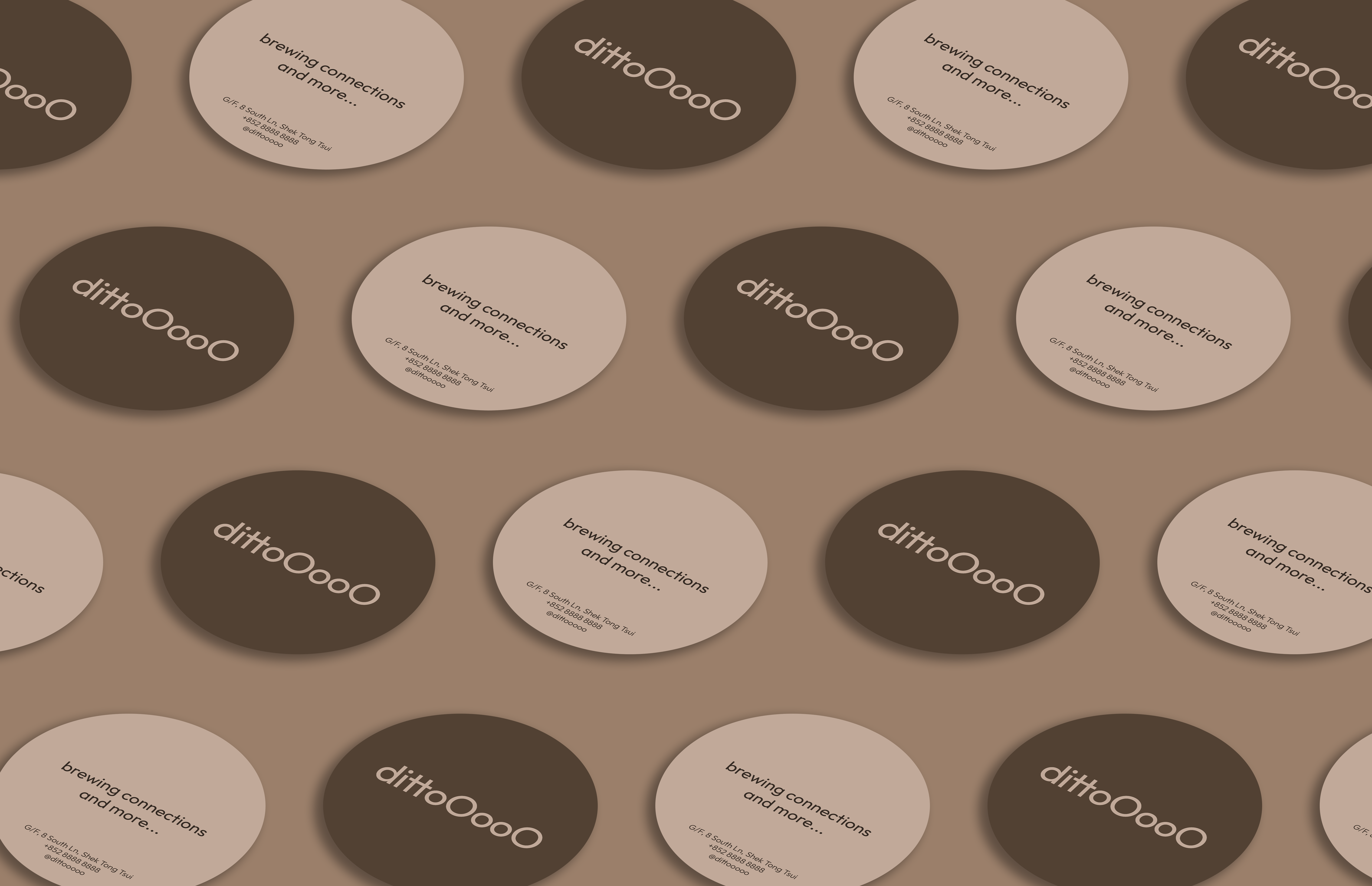
The Ditto wordmark creatively combines a sans-serif typeface with a handwritten script style, embodying a harmonious blend of old and new. This juxtaposition not only reflects modernity but also pays homage to traditional forms of communication. The script element features the connected letters "i" and "t," symbolizing the intrinsic bonds that unite individuals. This visual representation serves as a reminder of the importance of human connection in every interaction.
Furthermore, the letter "i" in the script resembles the Chinese character "人," which translates to "human" or "people." This subtle yet impactful choice adds depth to the design, reinforcing Ditto's commitment to community and inclusivity. The dot above the "i" echoes the idea of individuals, signifying that everyone is an integral part of the Ditto experience.
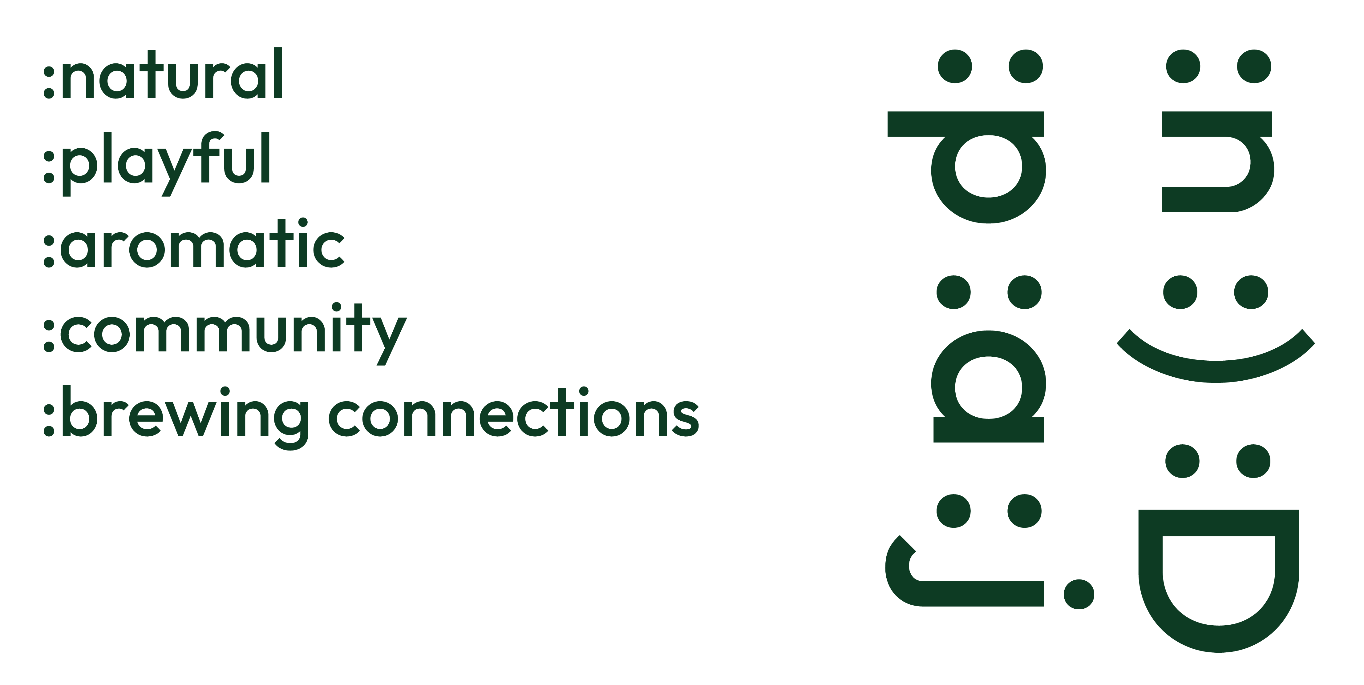
These visual elements extend across various communication channels, where each sentence begins with a colon (:). This design choice not only adds a unique stylistic flair but also evokes the appearance of emoticons, introducing a sense of fun and playfulness to the brand. By incorporating these features, Ditto creates an inviting atmosphere that encourages creativity and joyful interactions, making it a vibrant hub for the community.
The Ditto wordmark creatively combines a sans-serif typeface with a handwritten script style, embodying a harmonious blend of old and new. This juxtaposition not only reflects modernity but also pays homage to traditional forms of communication. The script element features the connected letters "i" and "t," symbolizing the intrinsic bonds that unite individuals. This visual representation serves as a reminder of the importance of human connection in every interaction.
Furthermore, the letter "i" in the script resembles the Chinese character "人," which translates to "human" or "people." This subtle yet impactful choice adds depth to the design, reinforcing Ditto's commitment to community and inclusivity. The dot above the "i" echoes the idea of individuals, signifying that everyone is an integral part of the Ditto experience.
These visual elements extend across various communication channels, where each sentence begins with a colon (:). This design choice not only adds a unique stylistic flair but also evokes the appearance of emoticons, introducing a sense of fun and playfulness to the brand. By incorporating these features, Ditto creates an inviting atmosphere that encourages creativity and joyful interactions, making it a vibrant hub for the community.


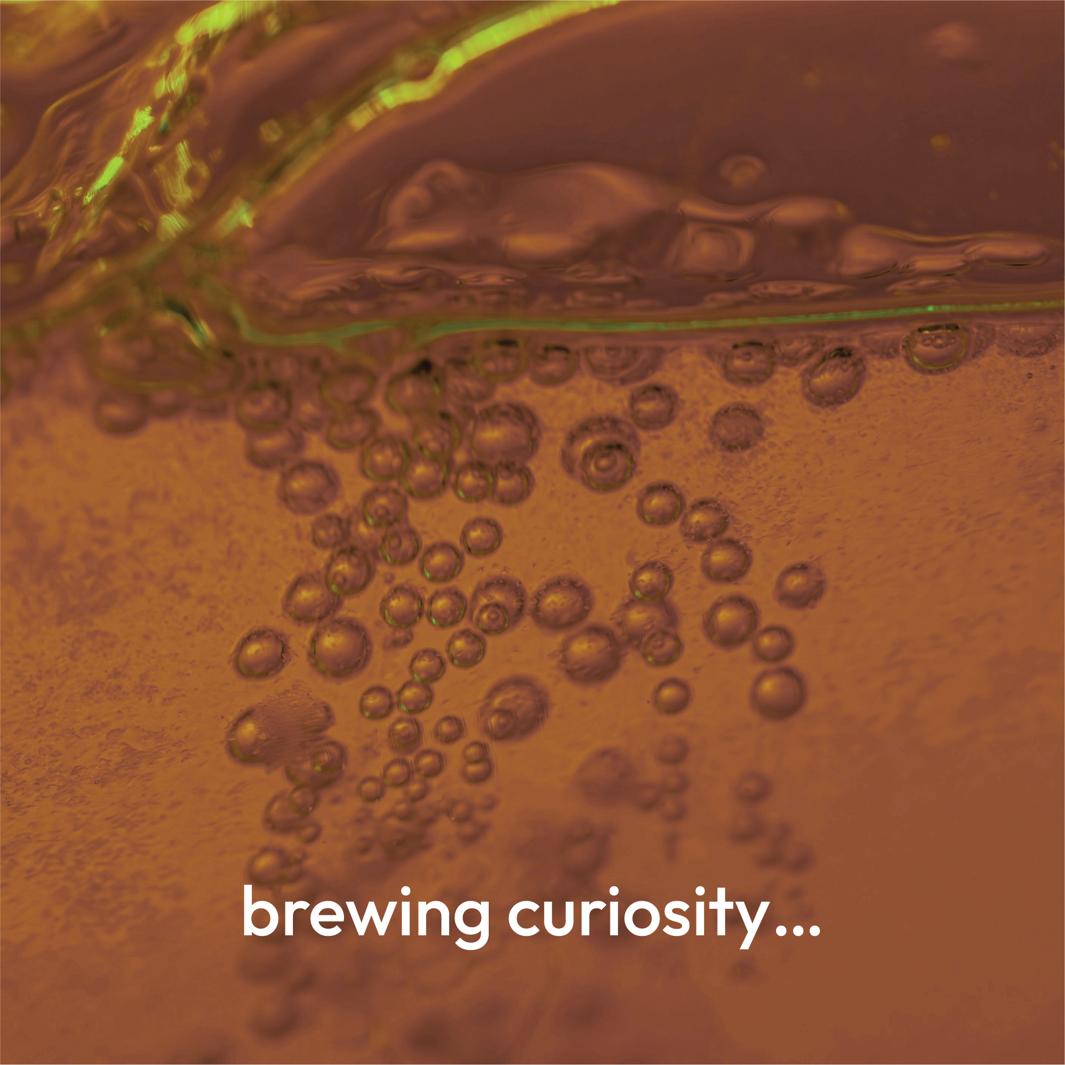


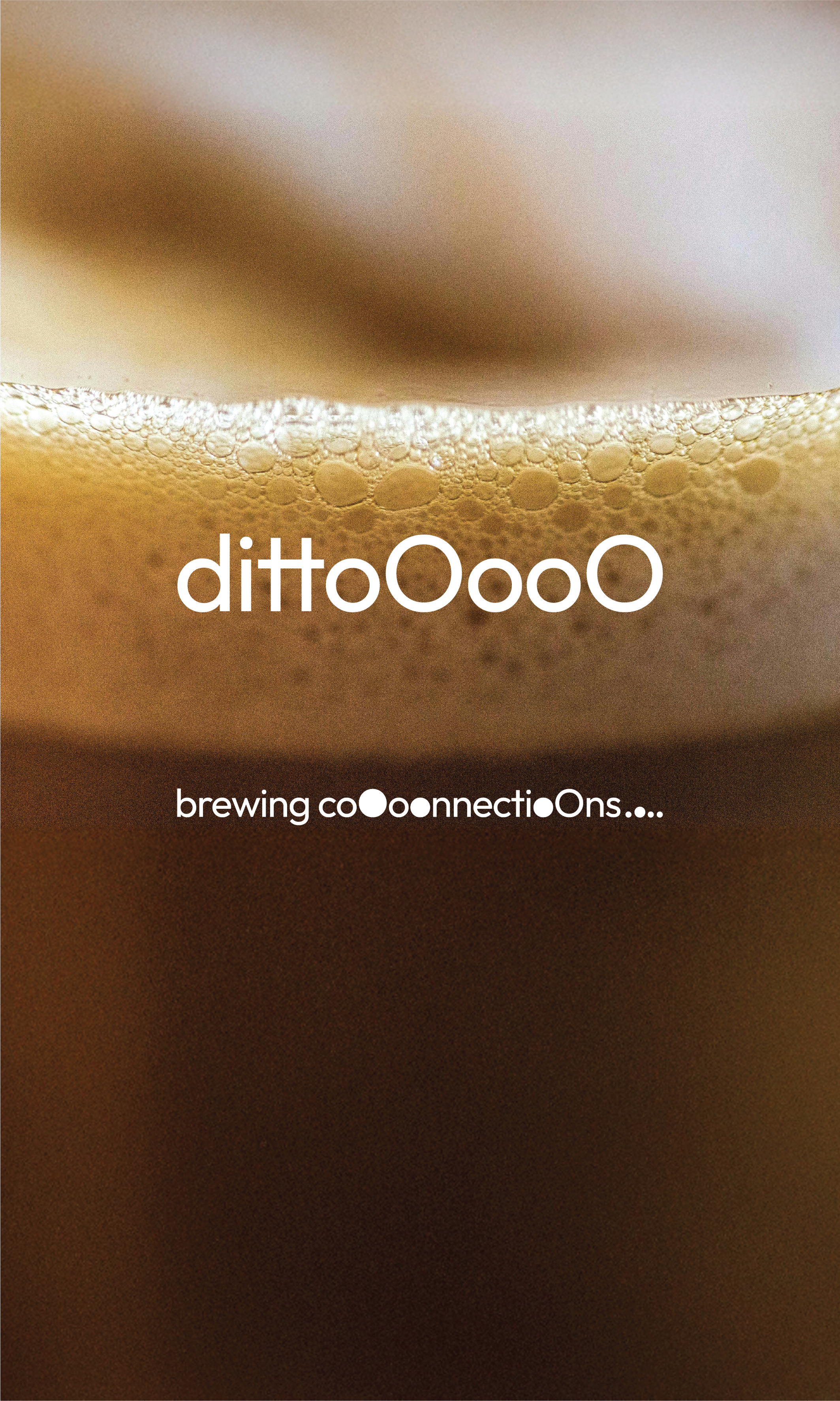
The second concept centers around the theme of brewing. Brewing can be interpreted in various ways, from the creation of beverages like coffee, tea, and cocktails to the generation of new ideas and the fostering of connections and relationships.
The wordmark for Ditto features additional "o"s at the end, creating a dynamic and playful effect. This design resembles the bubbles found in drinks or thought bubbles, symbolizing creativity and conversation. Additionally, the bubbles or dots represent individuals, aligning seamlessly with the identity of the Commons Lab.
The wordmark for Ditto features additional "o"s at the end, creating a dynamic and playful effect. This design resembles the bubbles found in drinks or thought bubbles, symbolizing creativity and conversation. Additionally, the bubbles or dots represent individuals, aligning seamlessly with the identity of the Commons Lab.