Henry
Yip
Henry Yip
The Seamless Experience of Hong Kong's Integrated Transport System
The various private operators in Hong Kong provide current transport experiences, the experiences are separated and information is not circulated between modes of transportation and operators, which causes information gaps in between. Passengers may get lost and confused when transferring transports.
The project aims to improve the overall transportation experience, both internally and externally, and design a seamless, coherent and consistent journey through unified branding and integrated transport systems.
The project aims to improve the overall transportation experience, both internally and externally, and design a seamless, coherent and consistent journey through unified branding and integrated transport systems.


Branding design
There are two major project components: Branding Design and Experience Design.
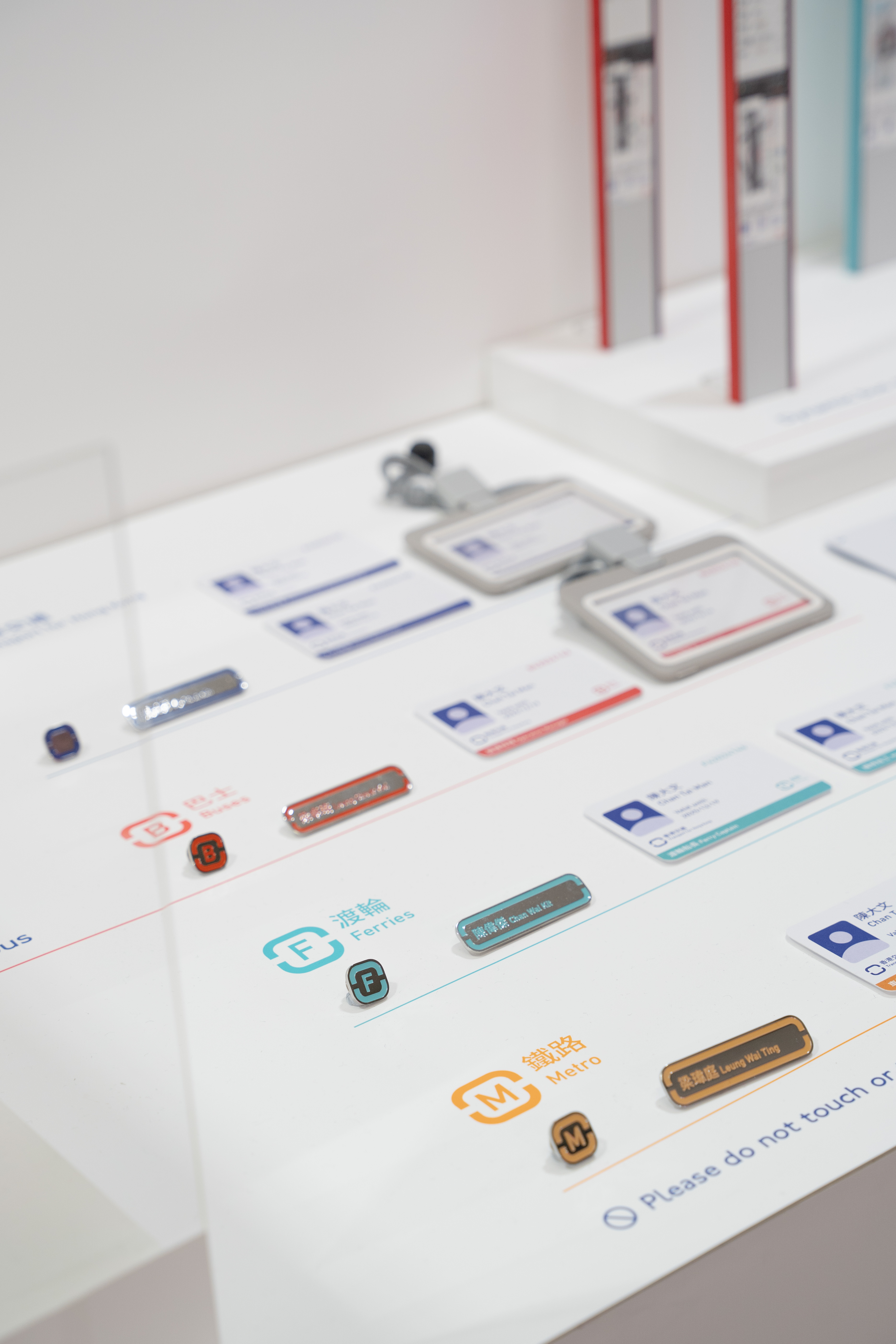
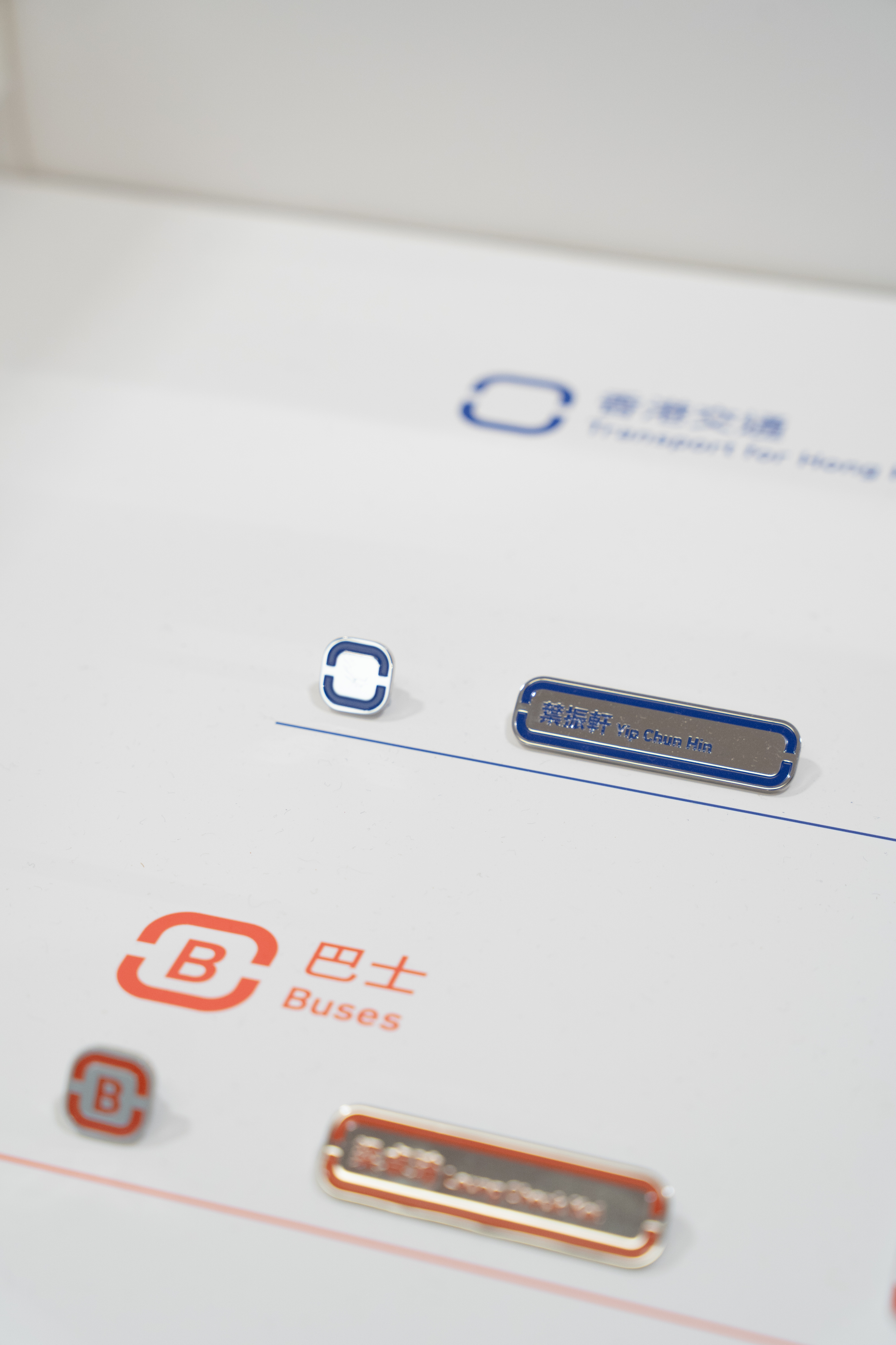
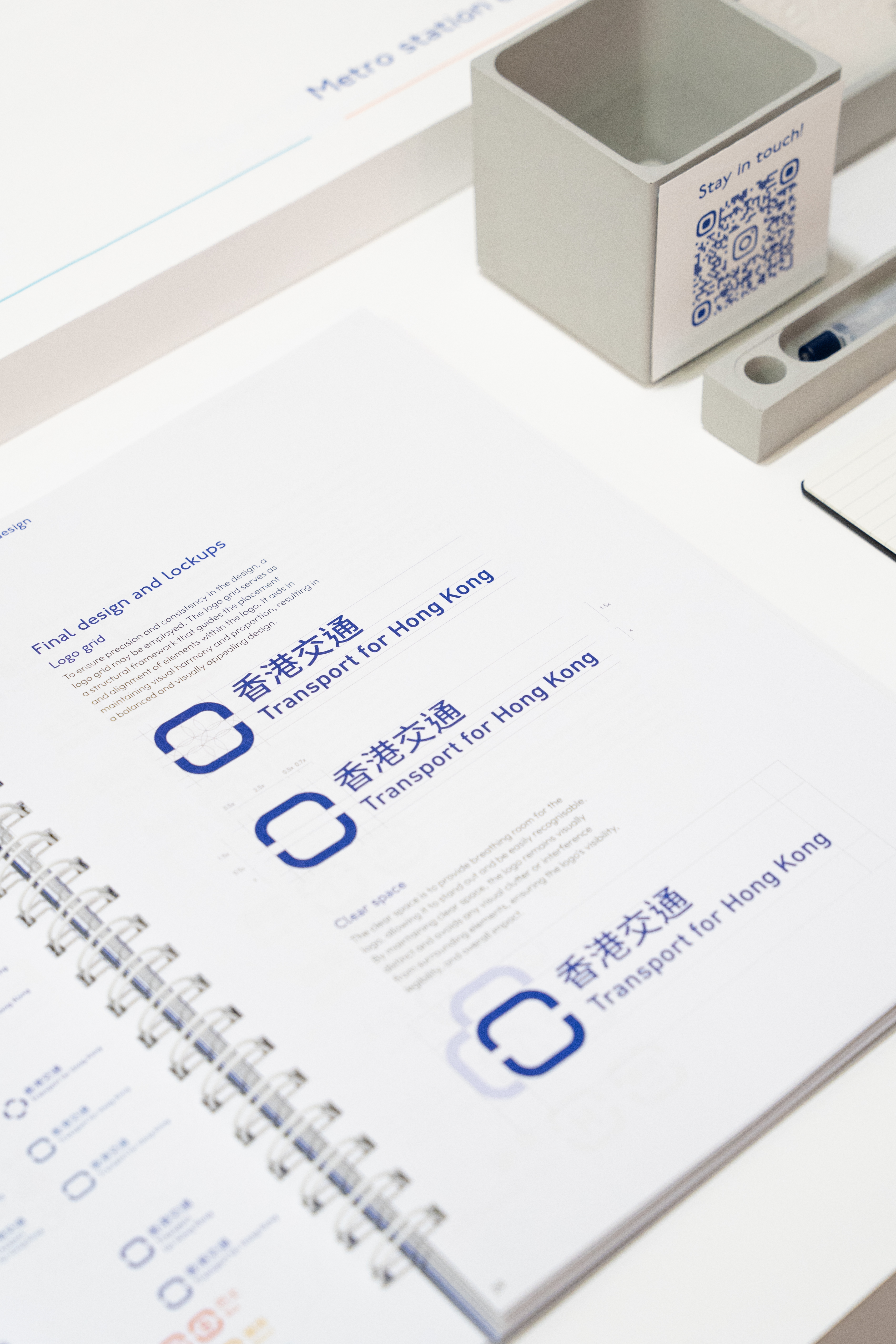
Branding Design involves brand identity, strategy, and visual elements such as pictograms, colour schemes and typography, and also brand items like staff cards and badges.
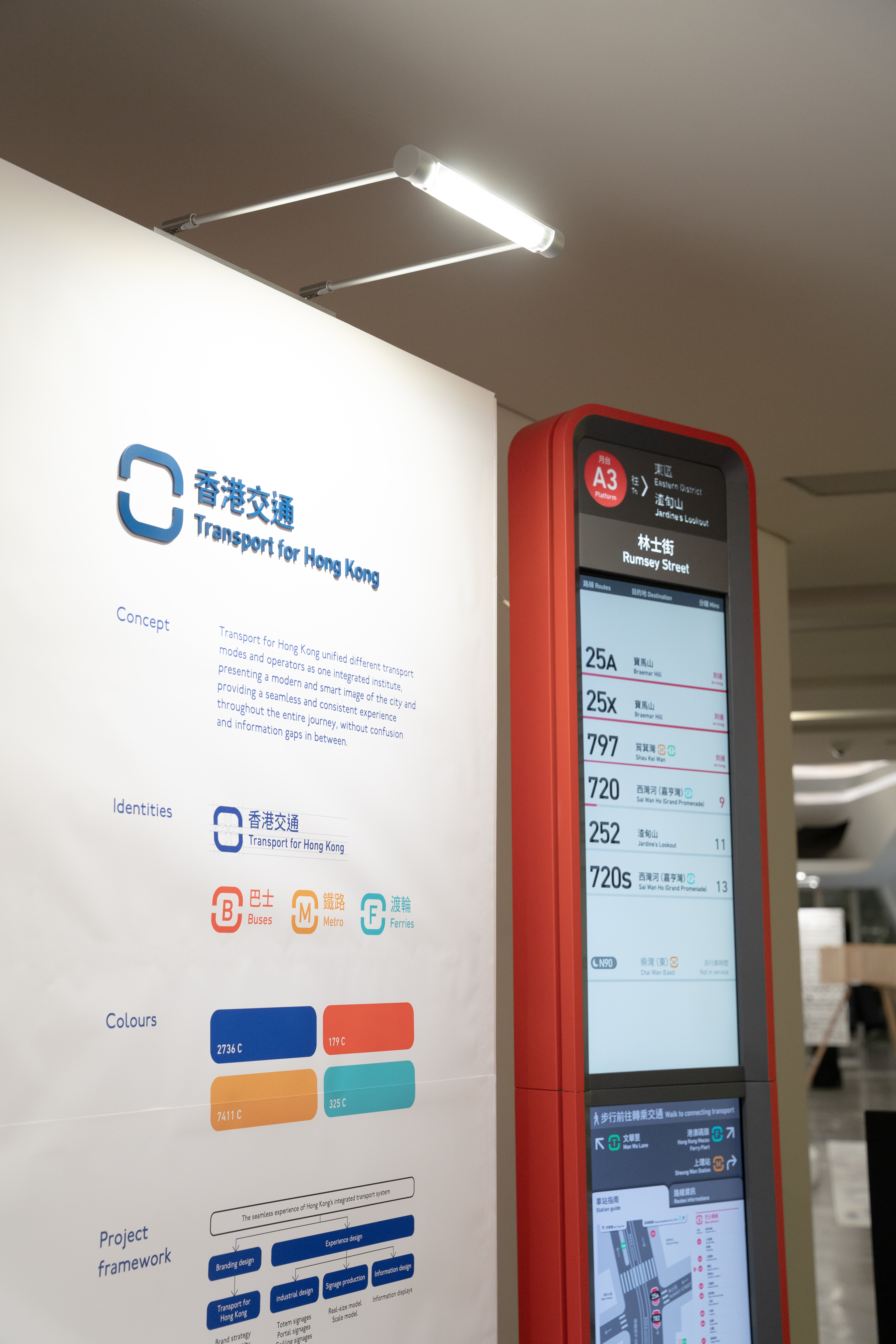
Transport for Hong Kong unified different transport modes and operators as one integrated institute, presenting a modern and smart image of the city and providing a seamless experience throughout the entire journey, without confusion and information gaps in between.
There are two major project components: Branding Design and Experience Design.
Branding Design involves brand identity, strategy, and visual elements such as pictograms, colour schemes and typography, and also brand items like staff cards and badges.
Transport for Hong Kong unified different transport modes and operators as one integrated institute, presenting a modern and smart image of the city and providing a seamless experience throughout the entire journey, without confusion and information gaps in between.
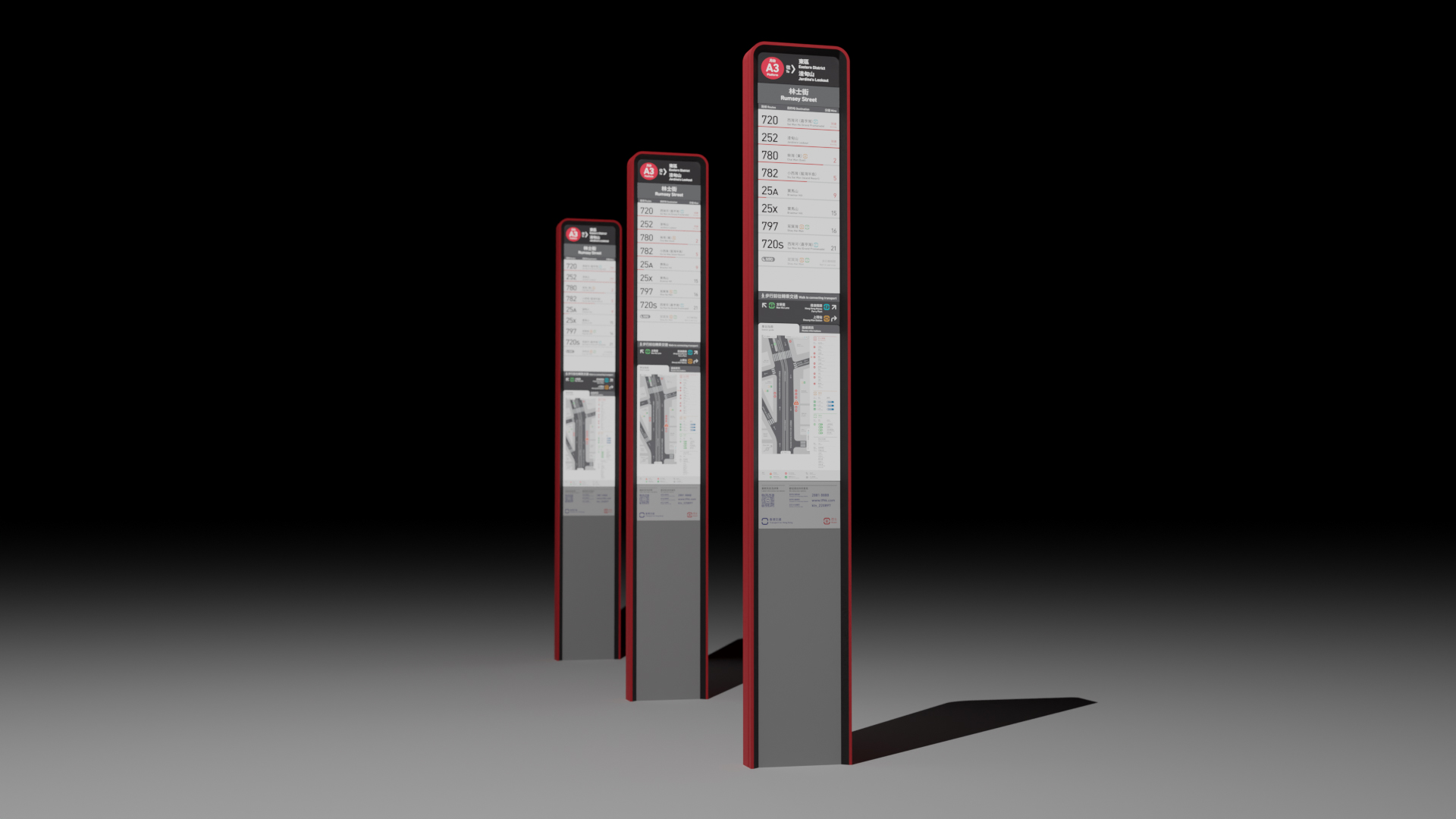


Bus stop totem
Experience design encompasses the industrial design of wayfinding touch points like totem signage, portal signage and ceiling signage. Signage prototype productions and information design.
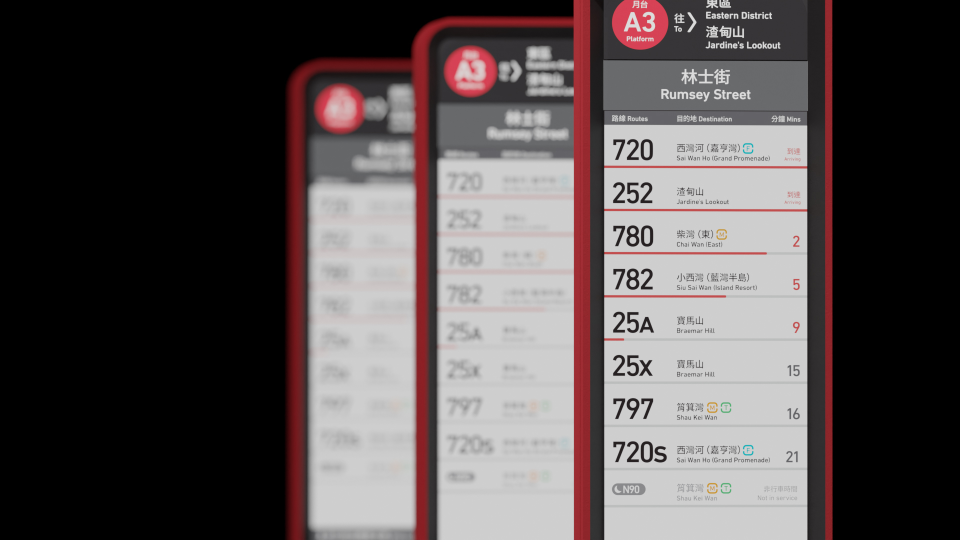
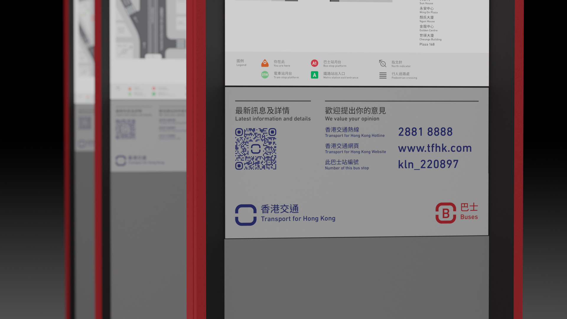
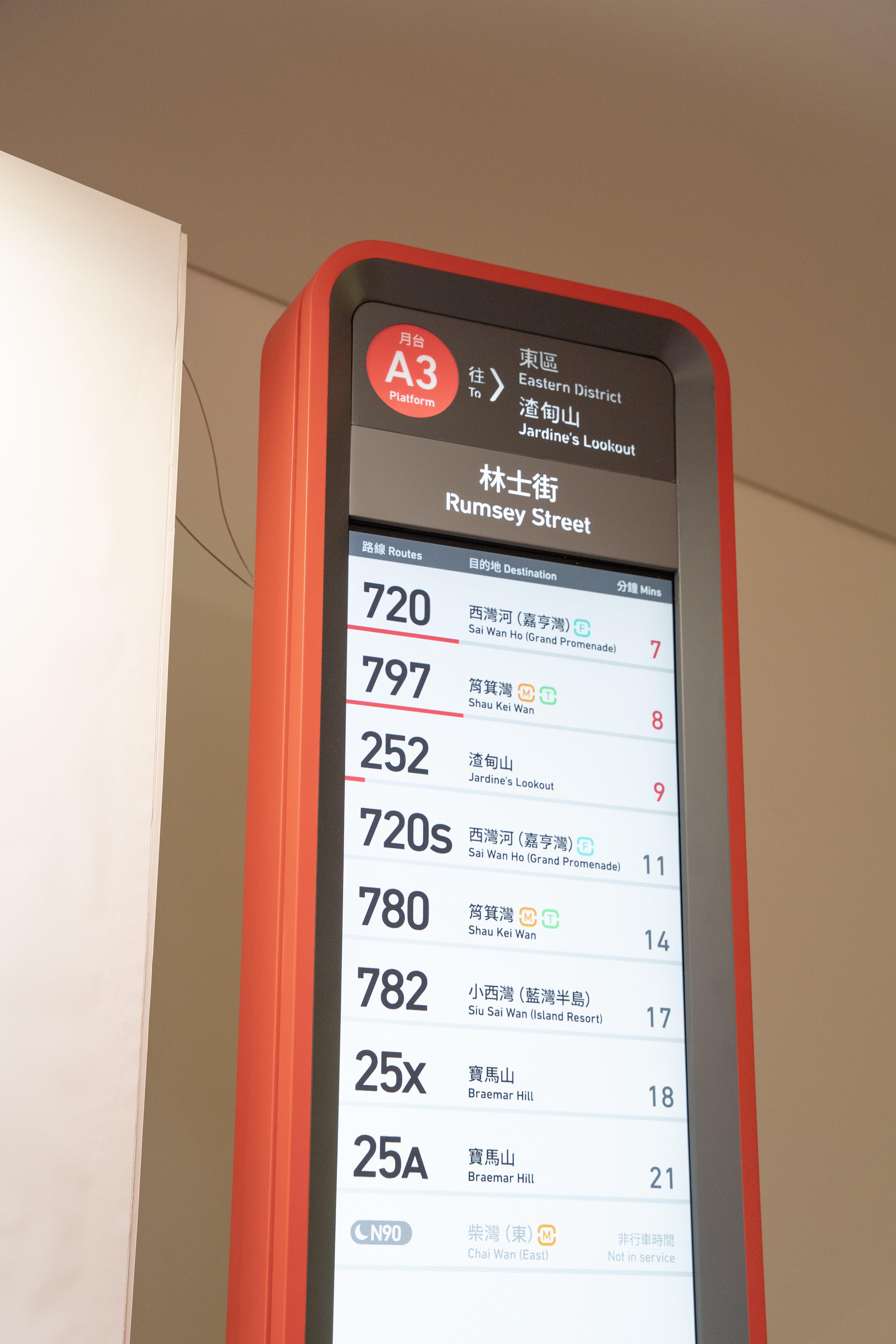
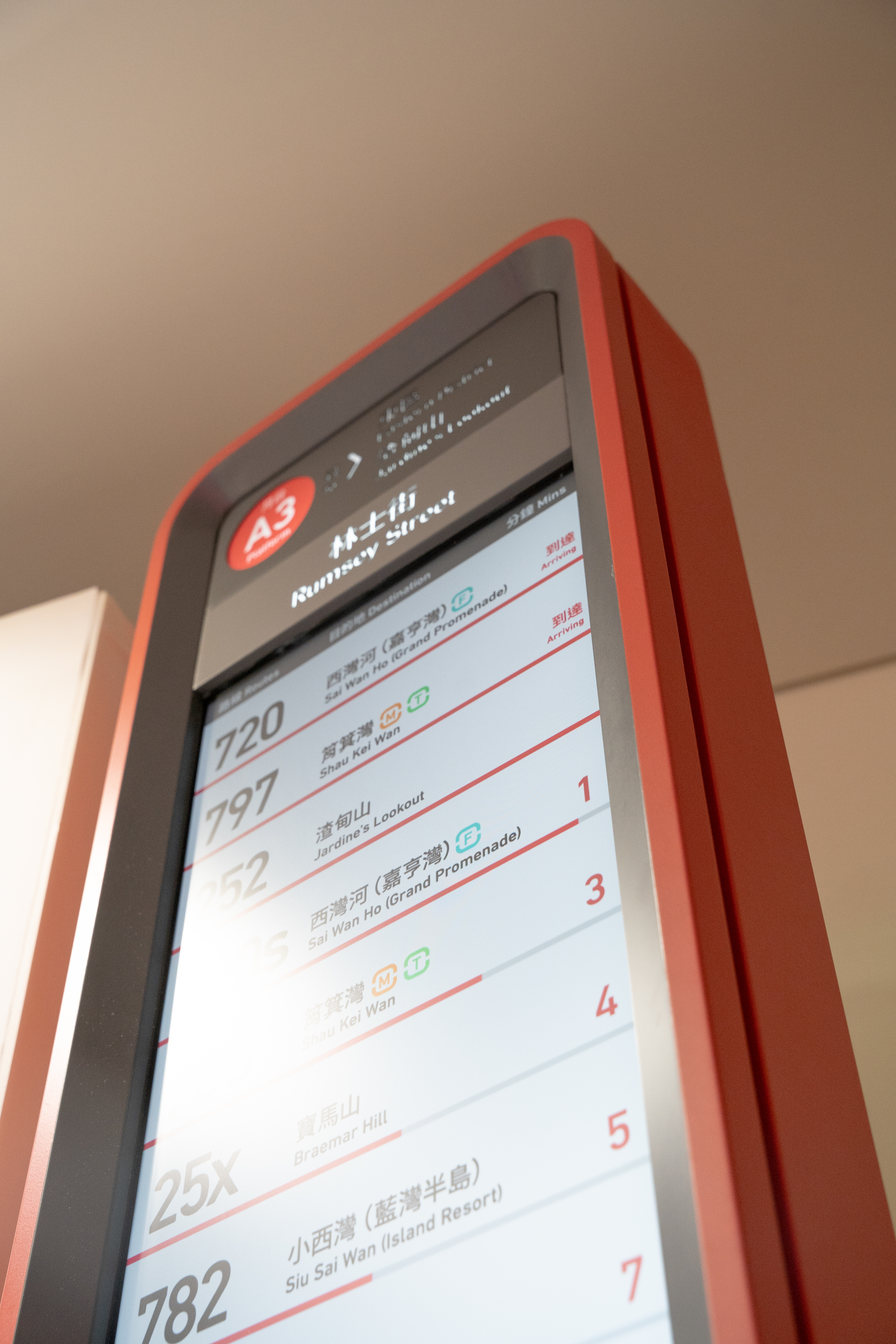
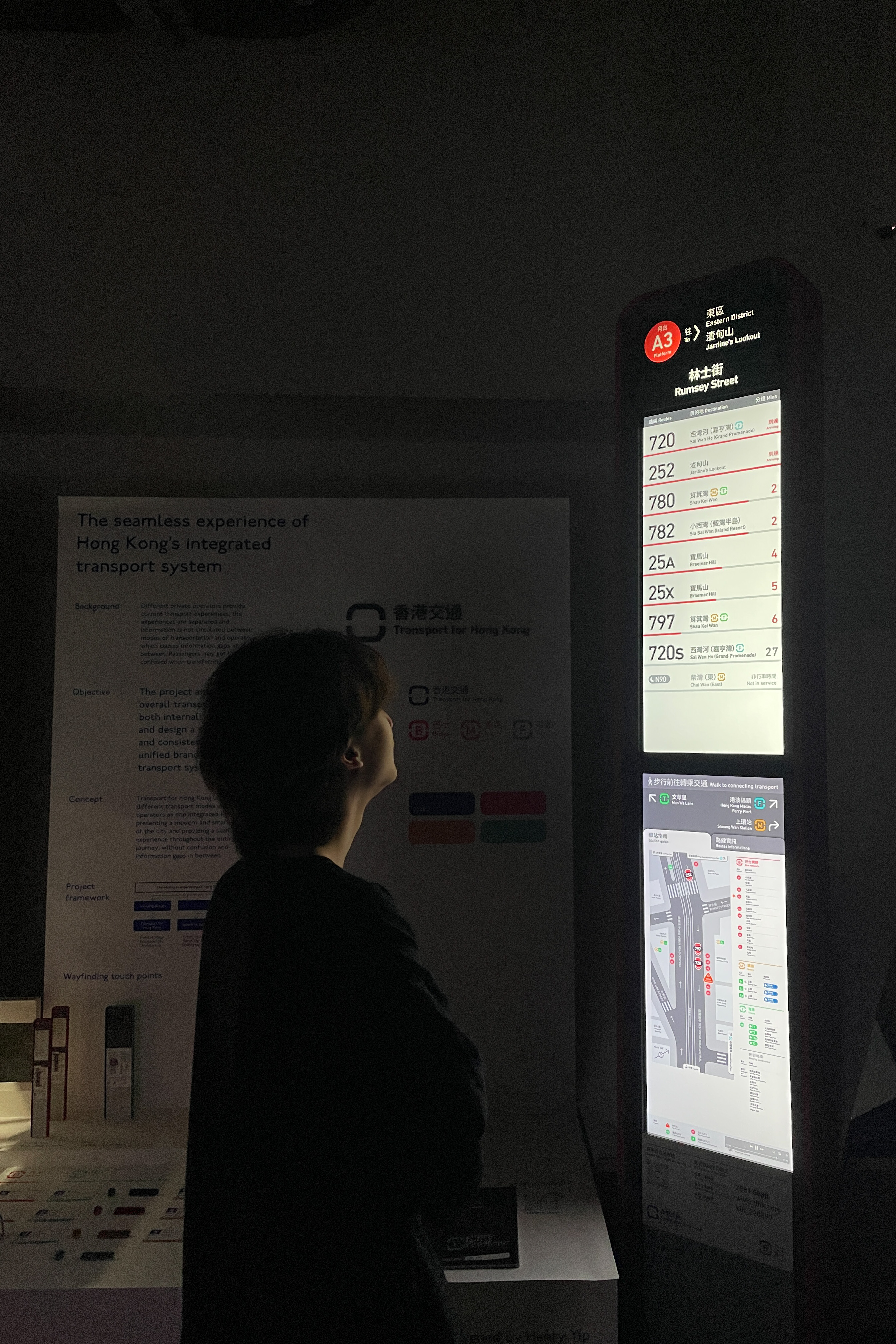
The redesigned bus stop totem incorporated with dynamic information displays showing coming departures, nearby map and transportation information.
Experience design encompasses the industrial design of wayfinding touch points like totem signage, portal signage and ceiling signage. Signage prototype productions and information design.
The redesigned bus stop totem incorporated with dynamic information displays showing coming departures, nearby map and transportation information.
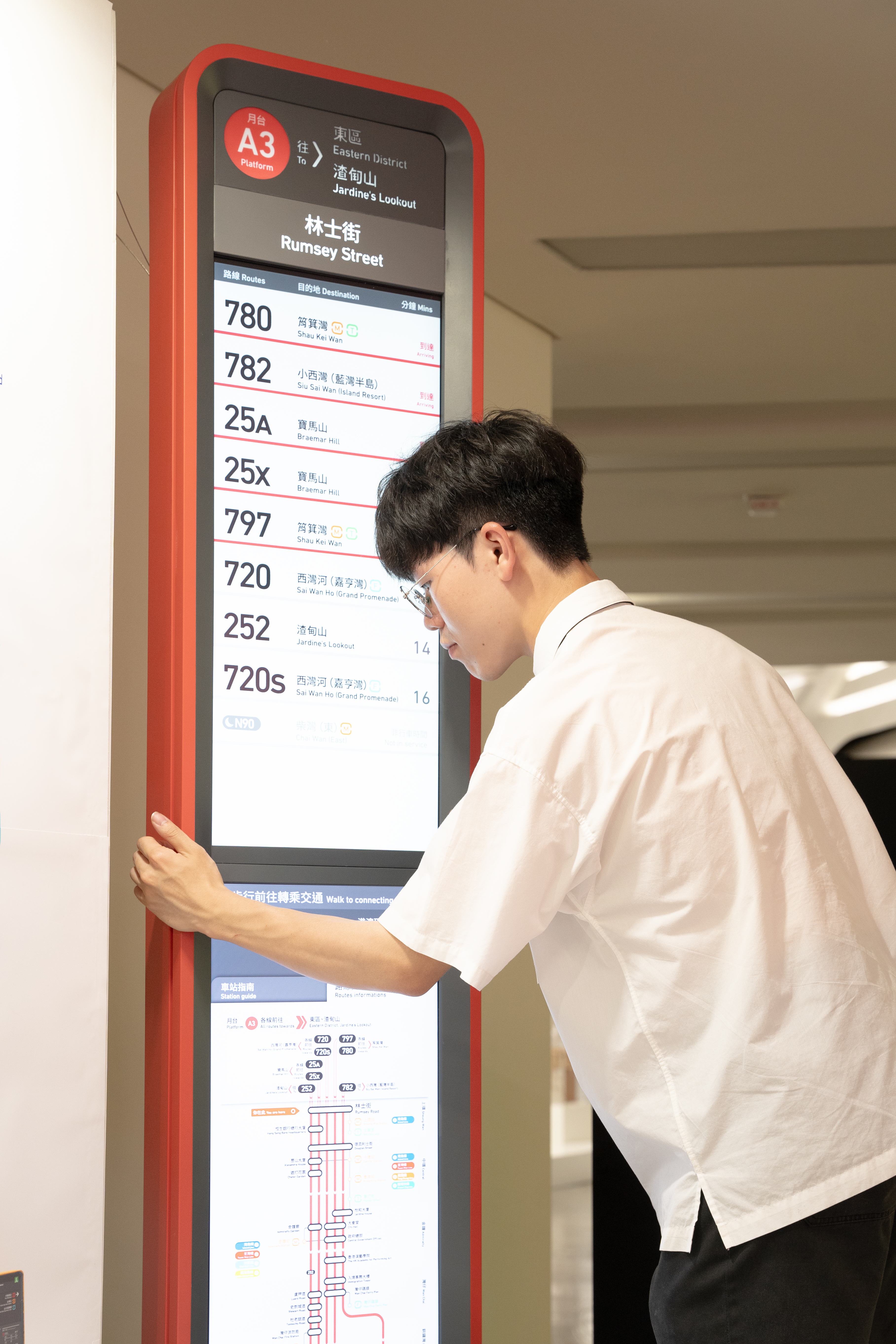
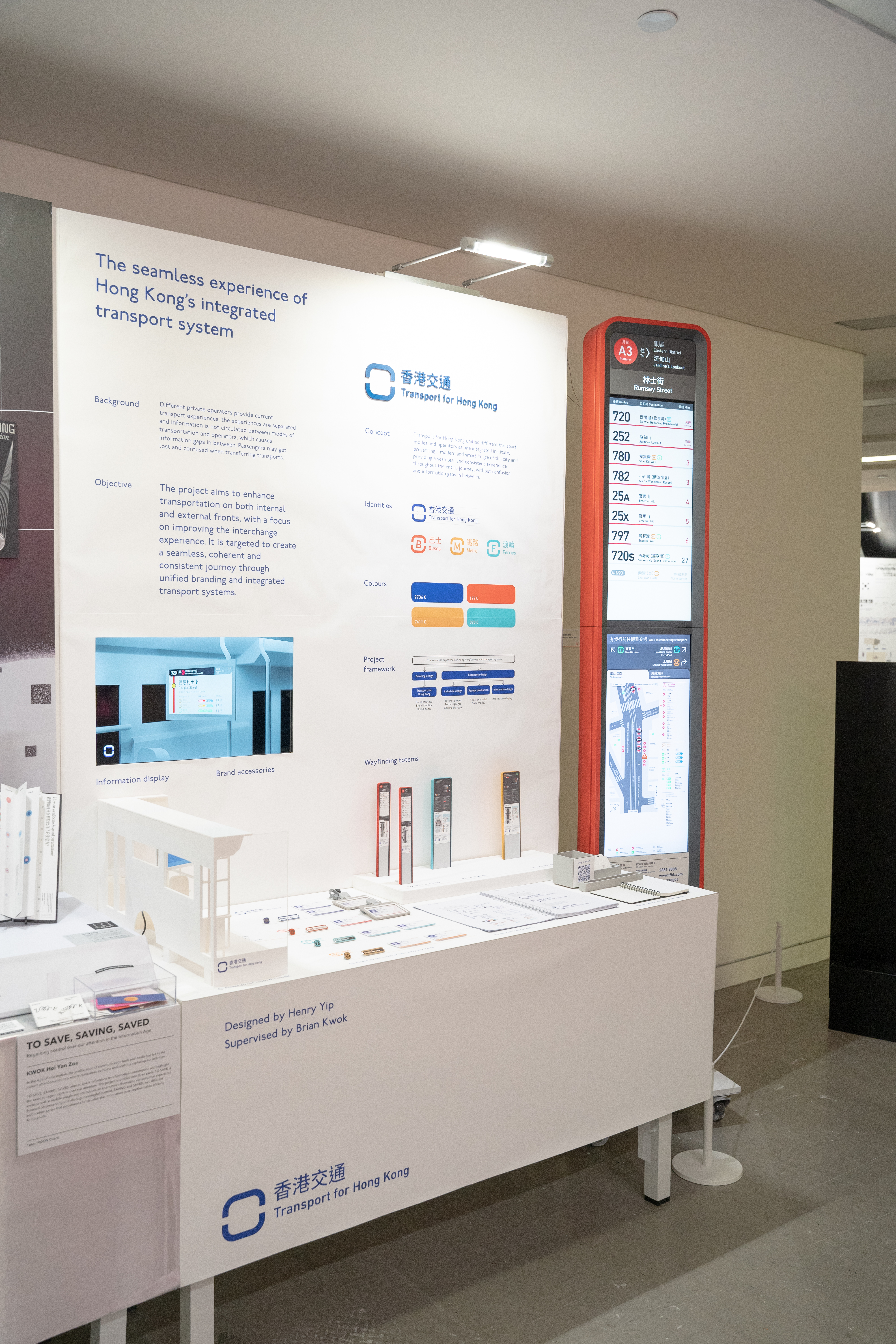
Real-scaled model production for bus stop totem
The project is produced a real-scaled model of the bus stop totem to present the industrial and information design solidly for the audiences. The model is made of stainless steels with two digital displays and a light box at the top, net weight over 60 kg.
The project is produced a real-scaled model of the bus stop totem to present the industrial and information design solidly for the audiences. The model is made of stainless steels with two digital displays and a light box at the top, net weight over 60 kg.
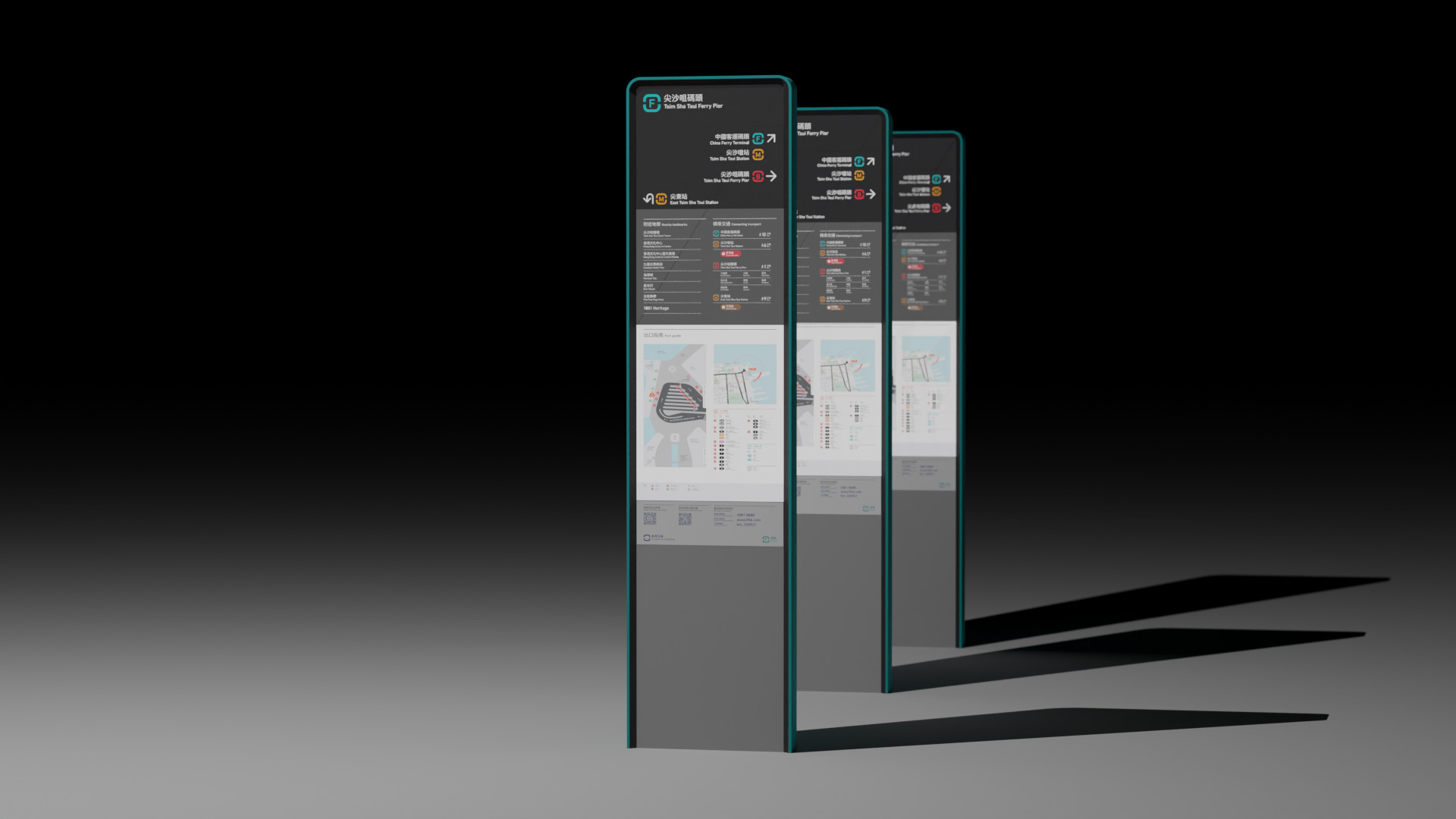


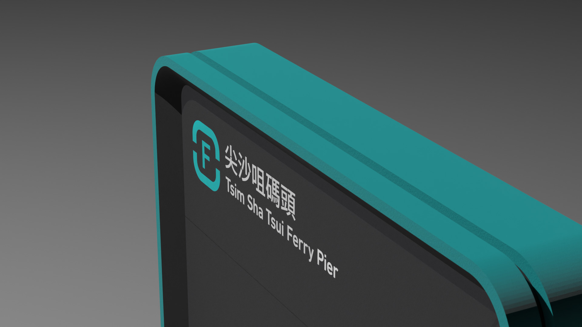


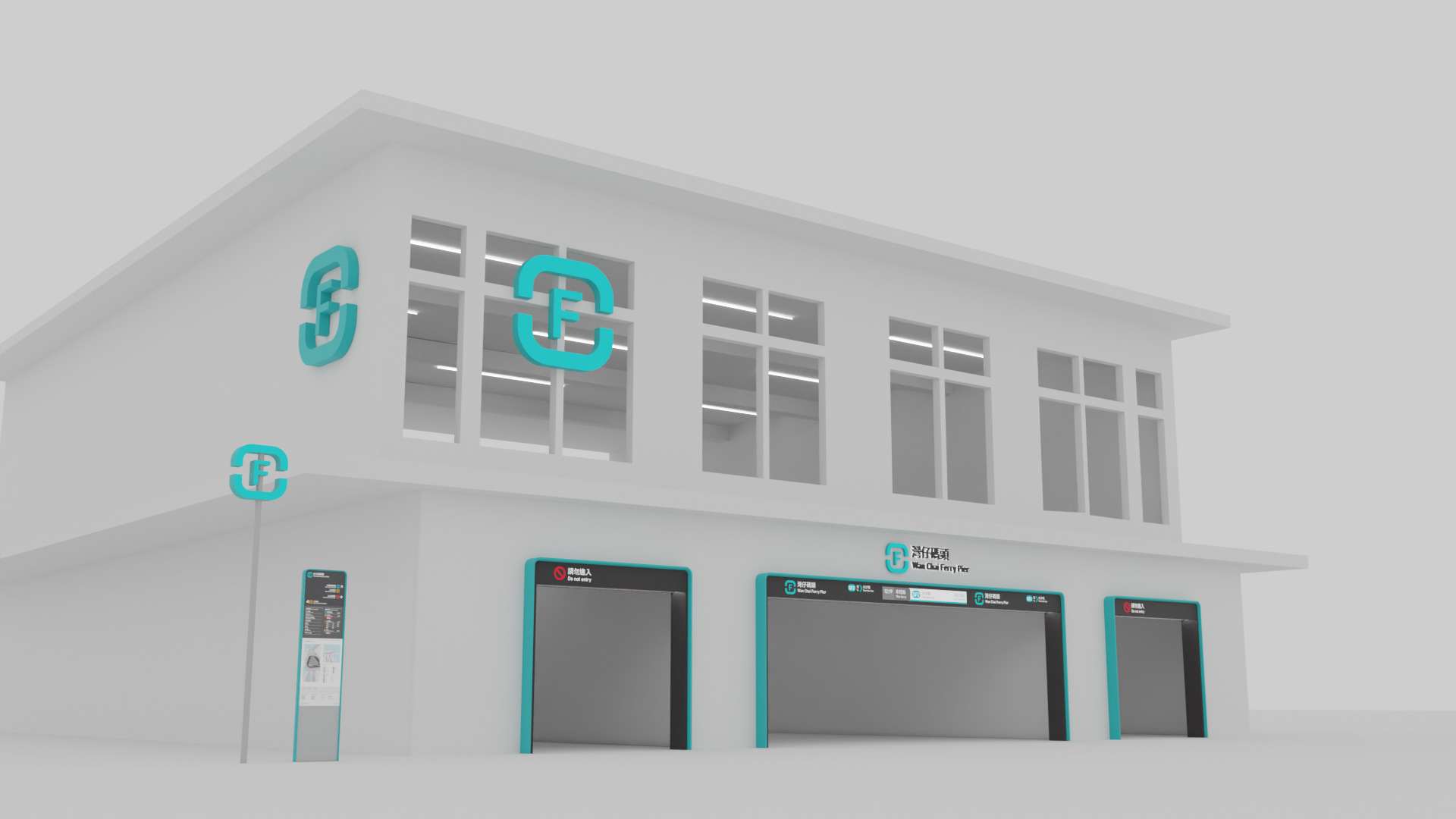

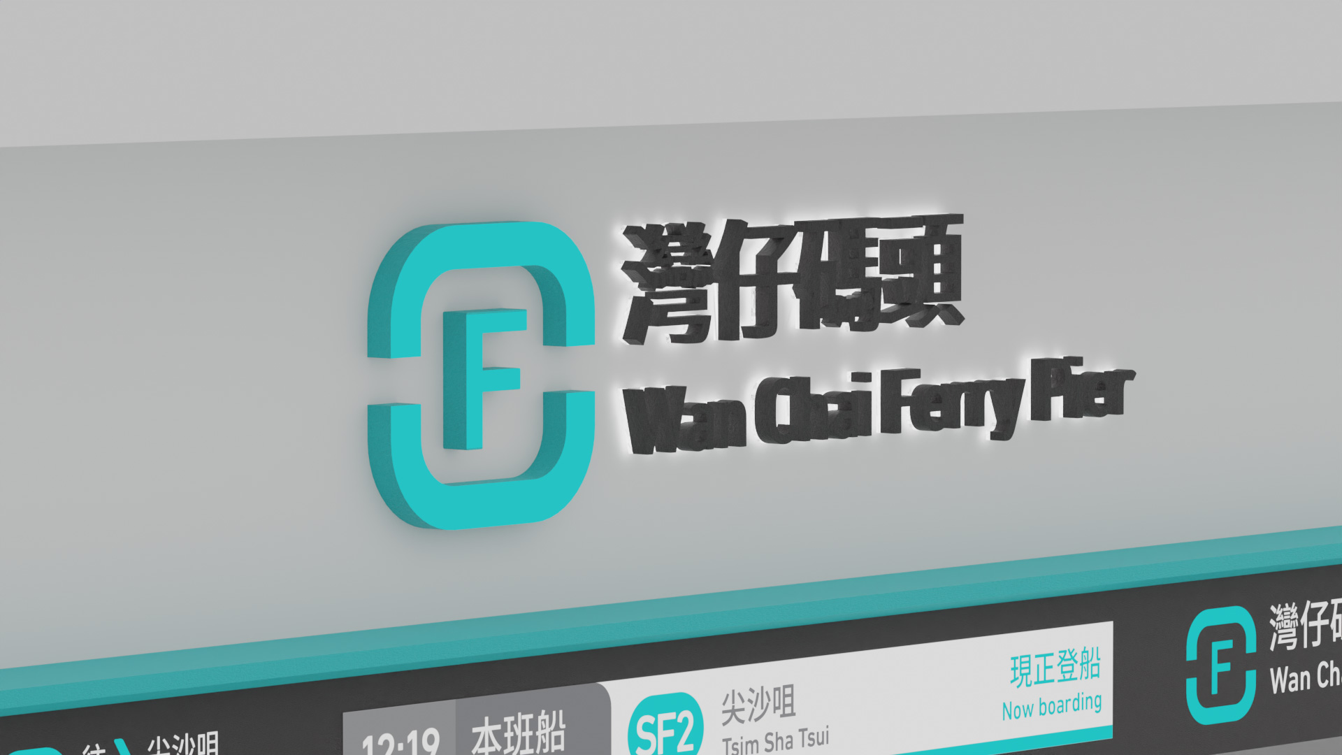


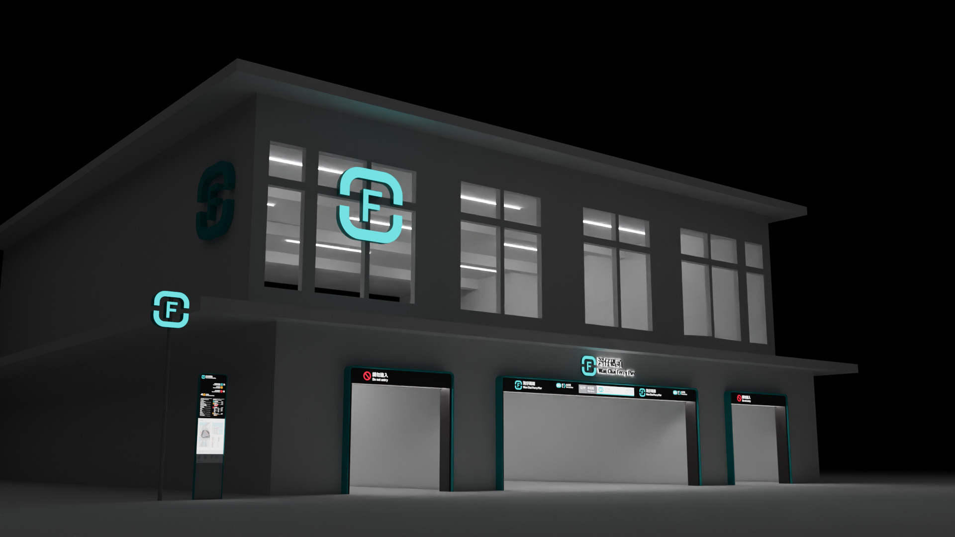

Ferry pier entrance portals
Ferry pier entrance portals are designed with consistent visual elements of the brand and other physical signages, strengthening the brand identity while highlighting the entrances.
The top of the portal is integrated with digital display showing coming departure to provide more information for the passengers.
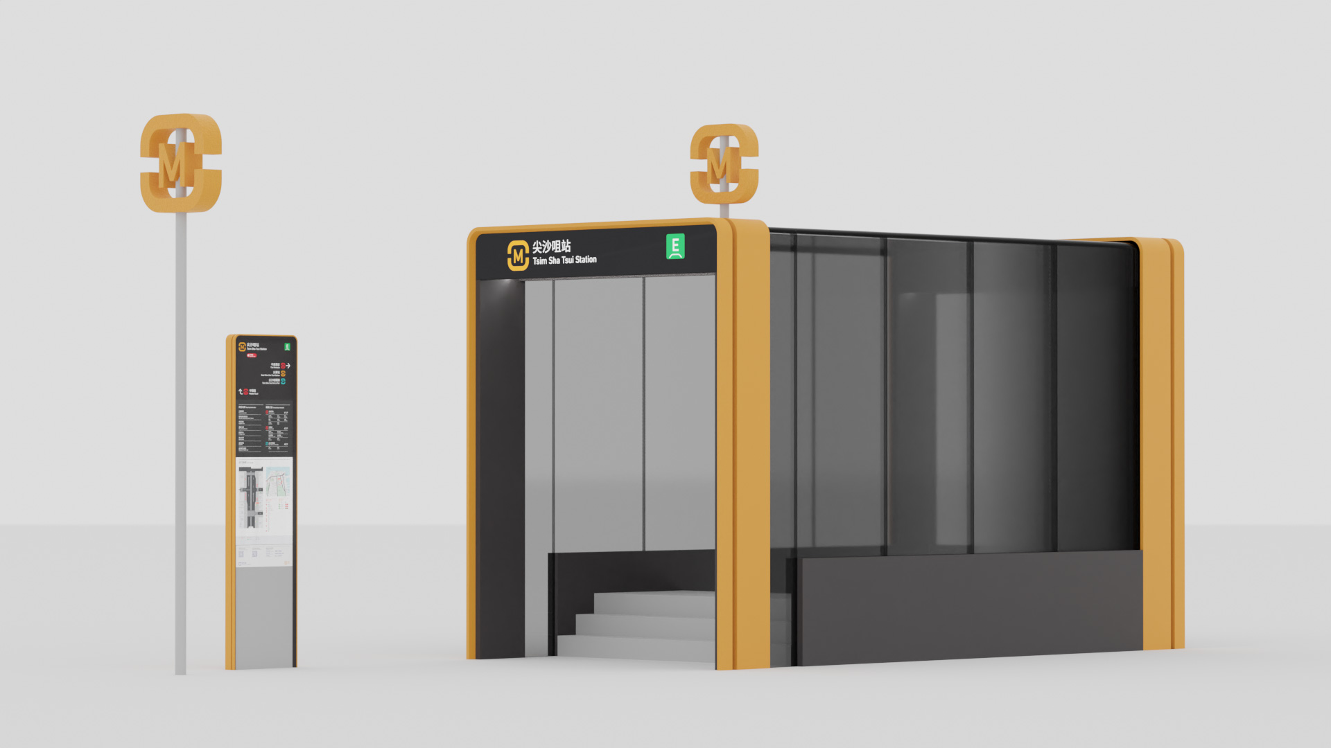

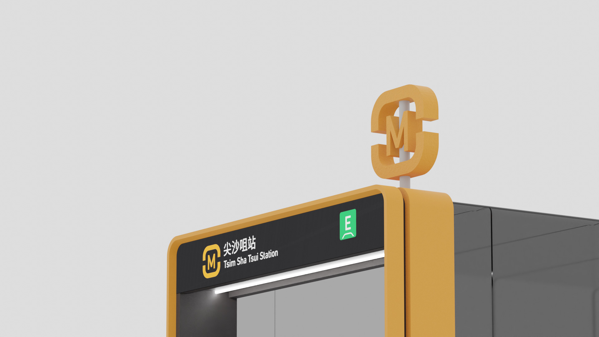
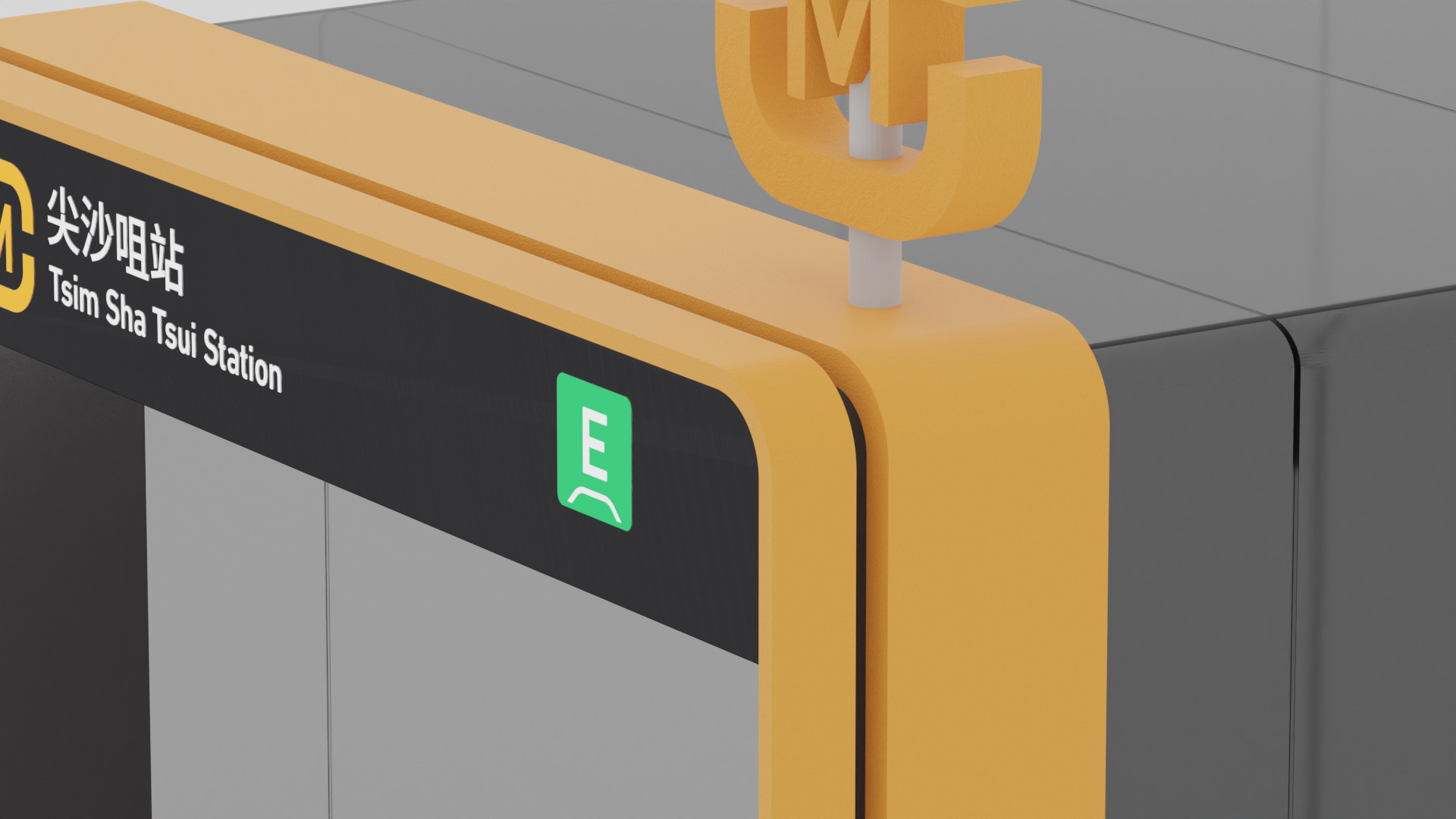


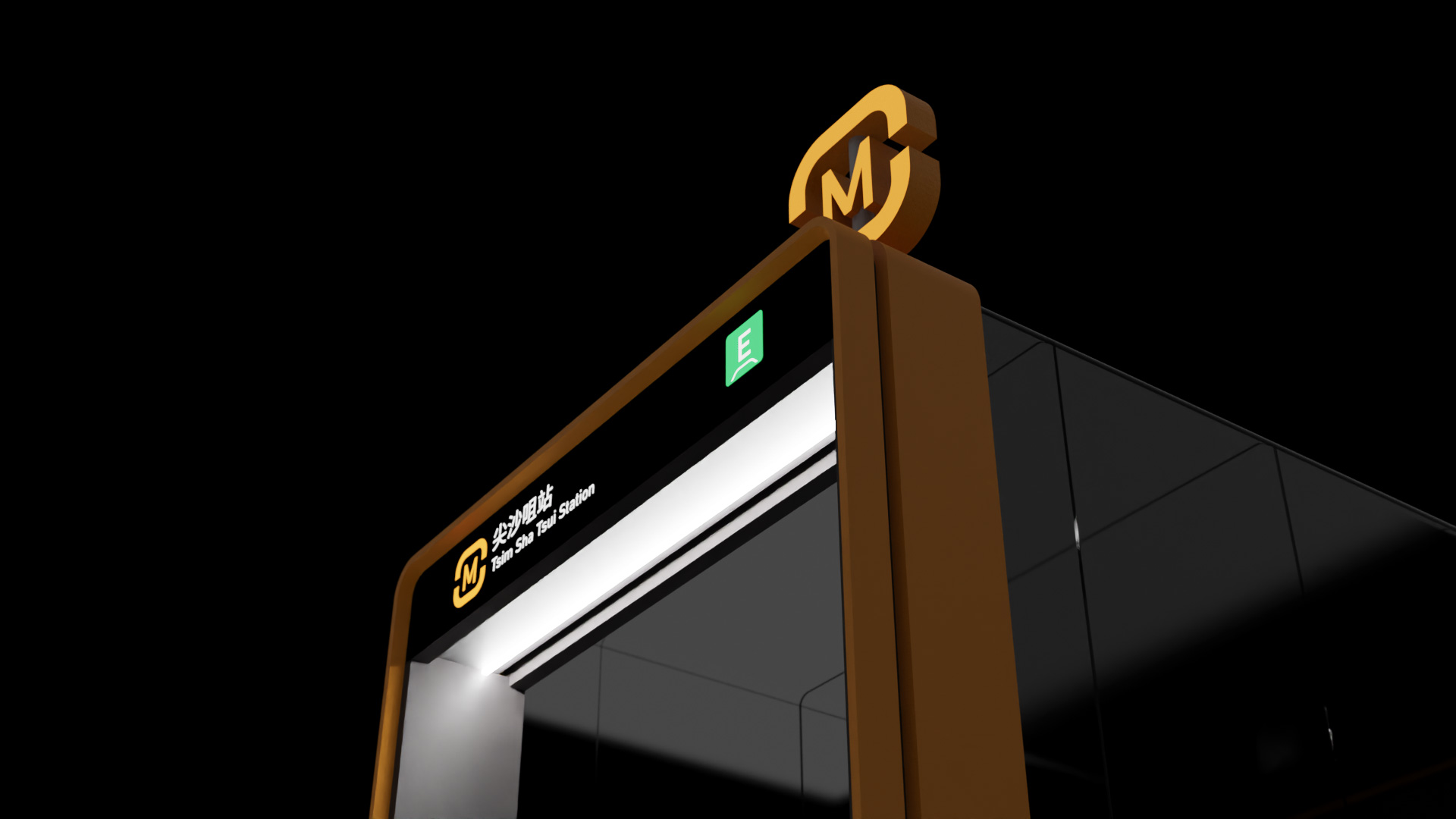

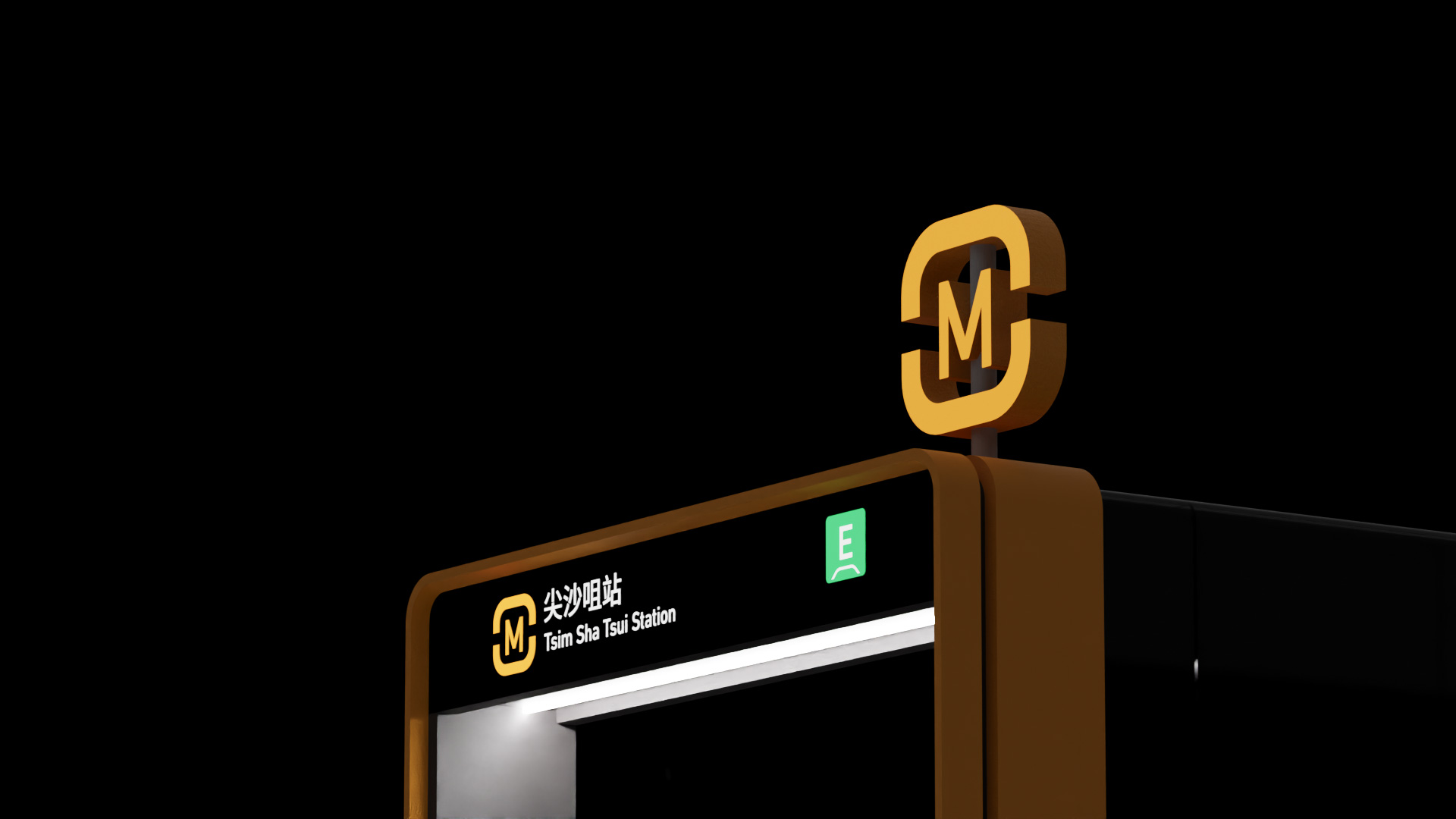
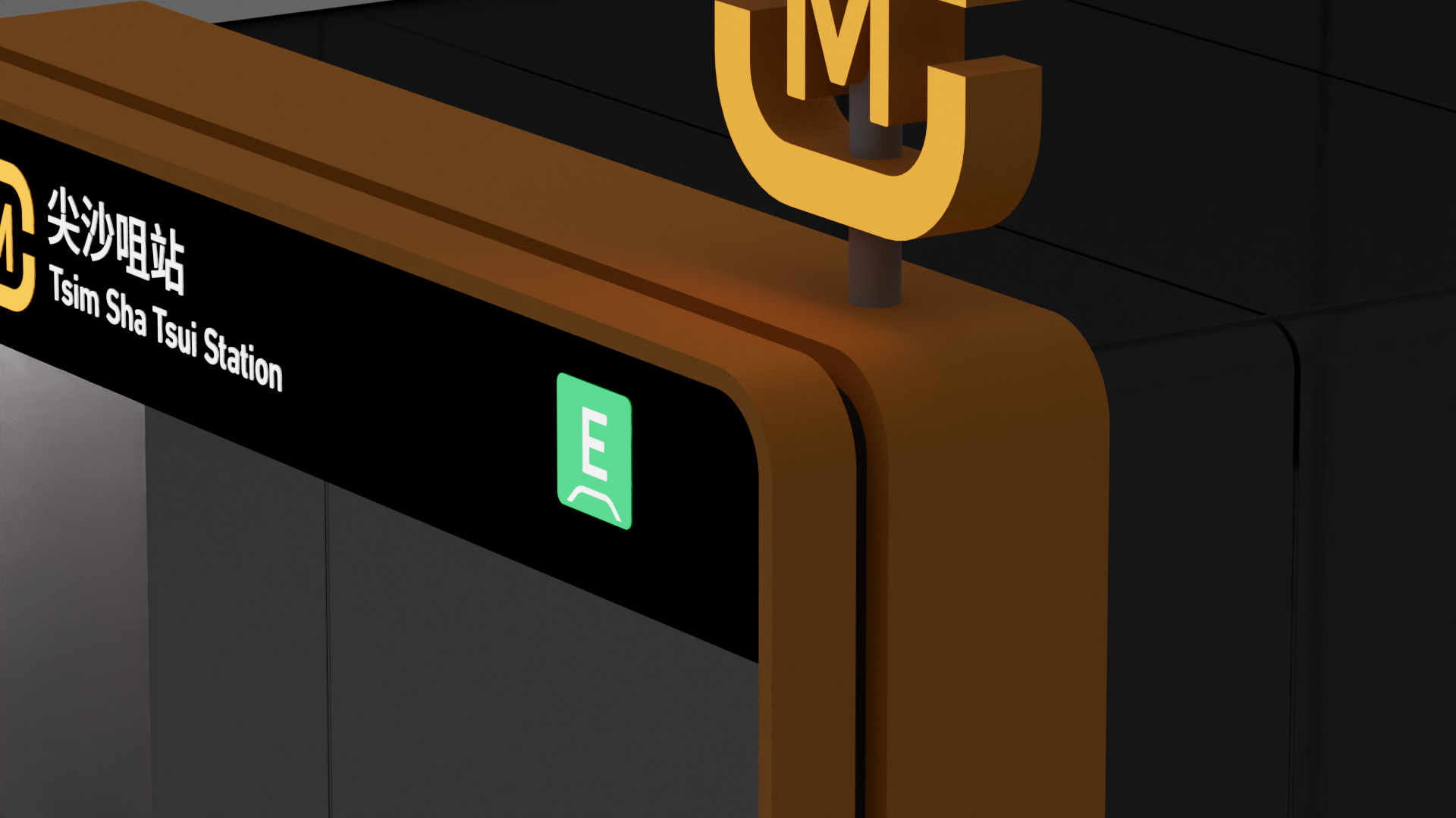

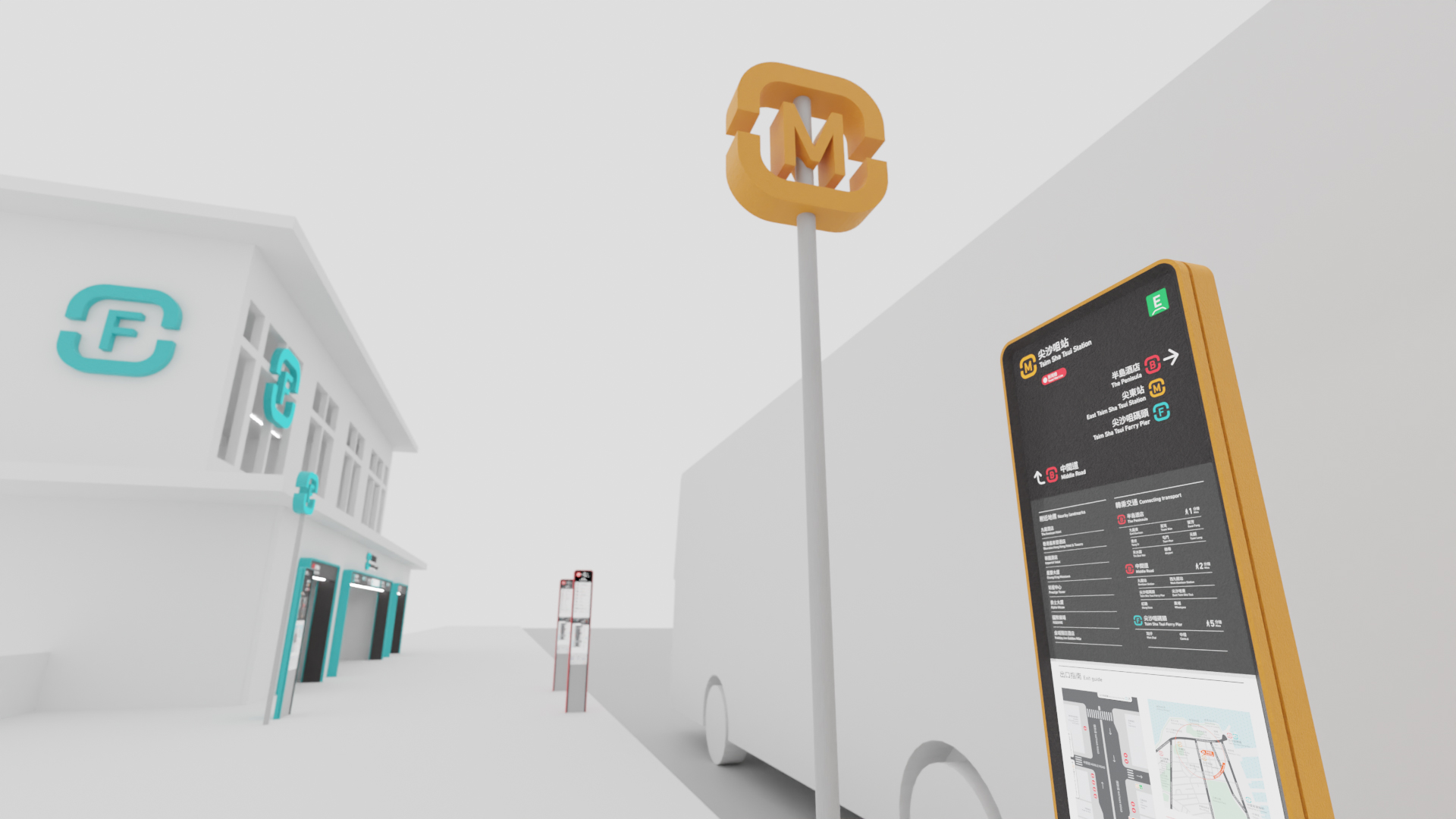
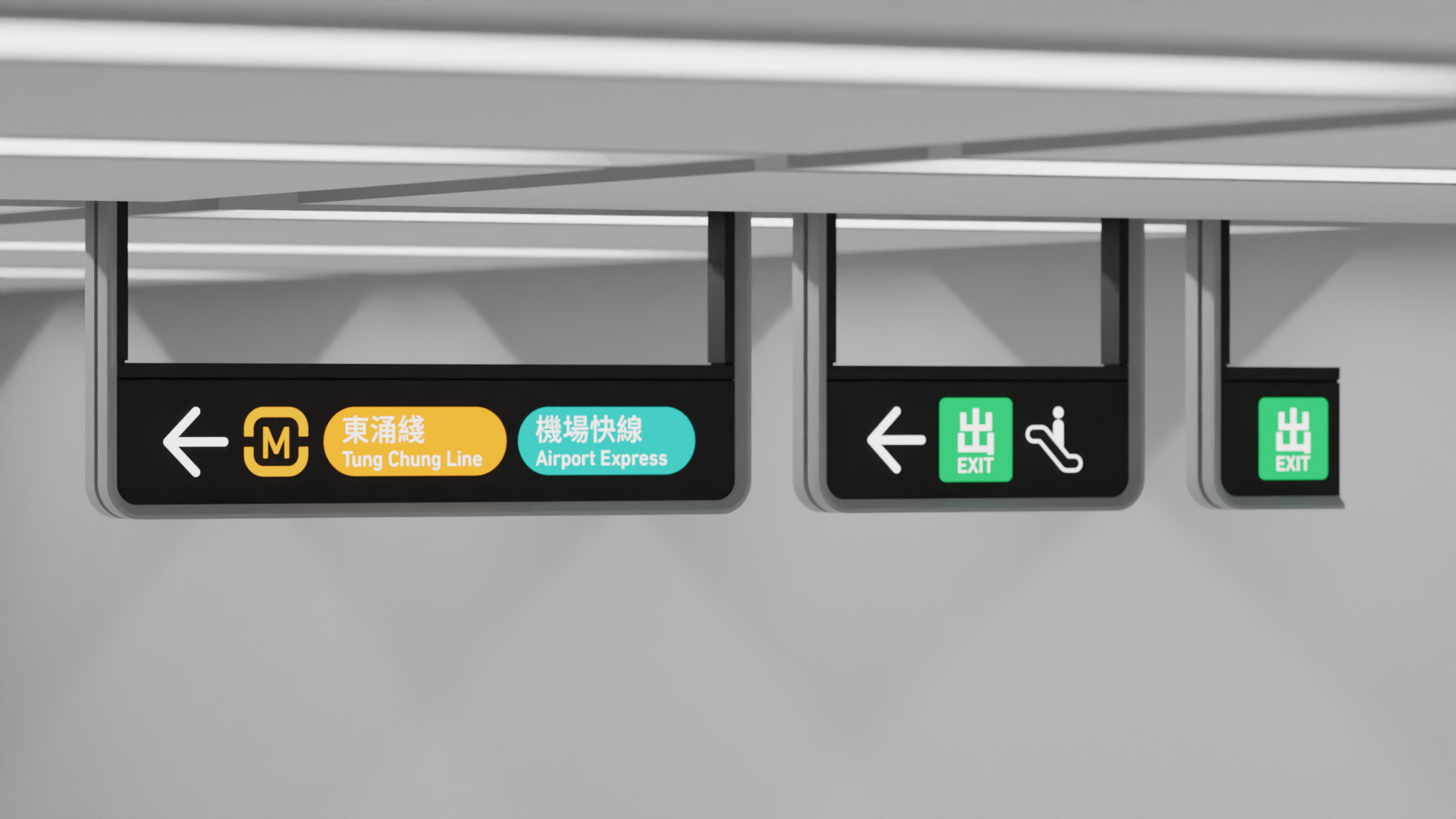
Metro station entrances portal
Metro station entrances are also designed with consistent visual elements of the brand and other physical signages, strengthening the brand identity while highlighting the access point.
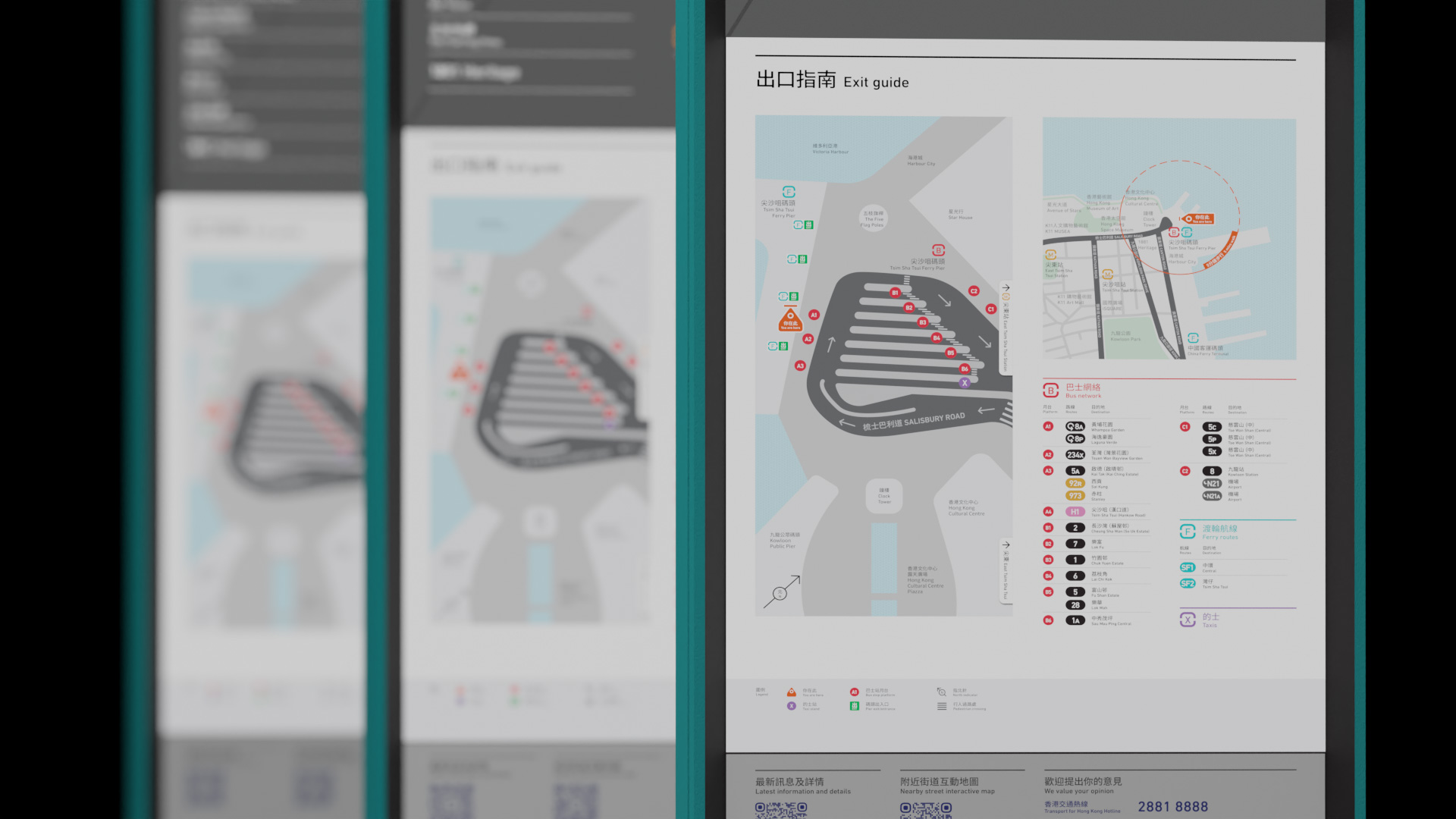
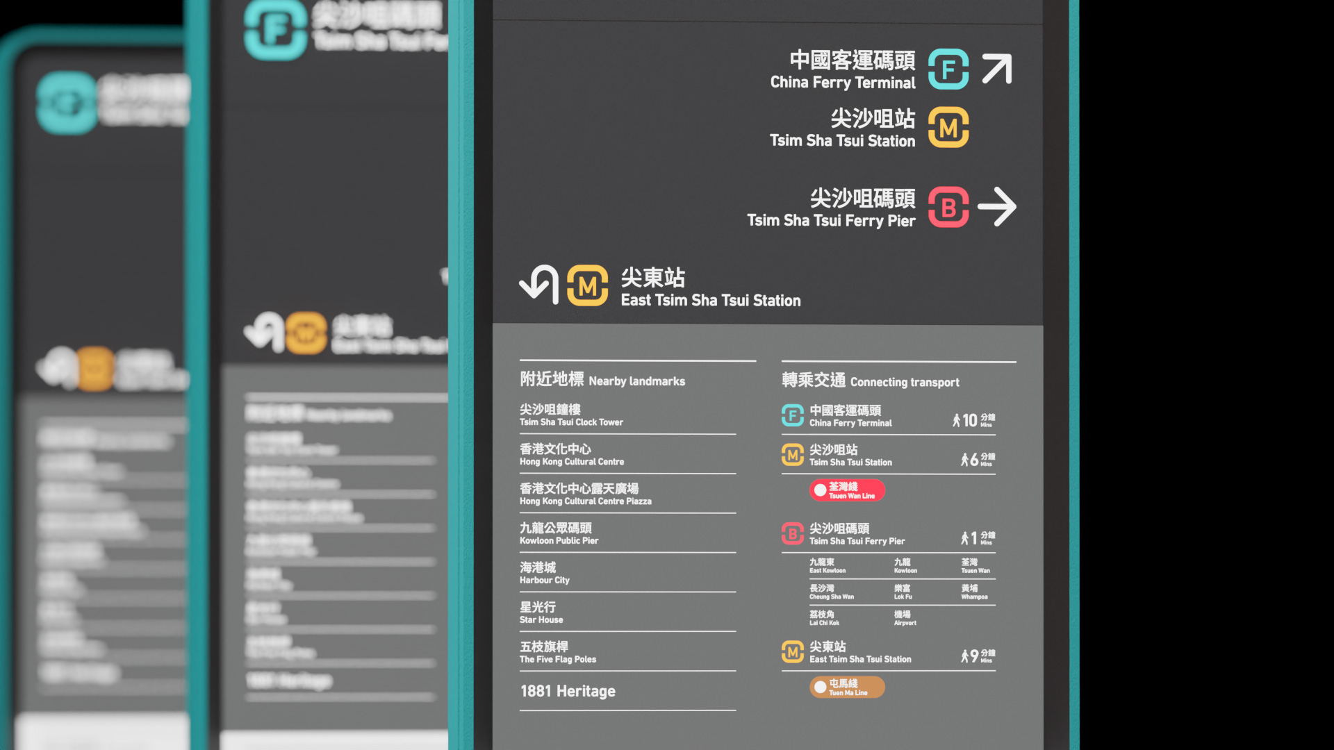
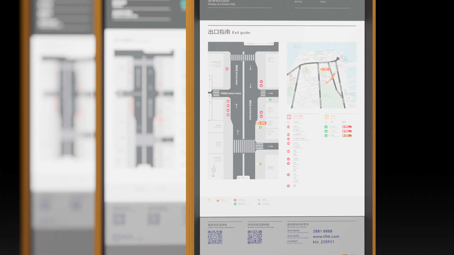
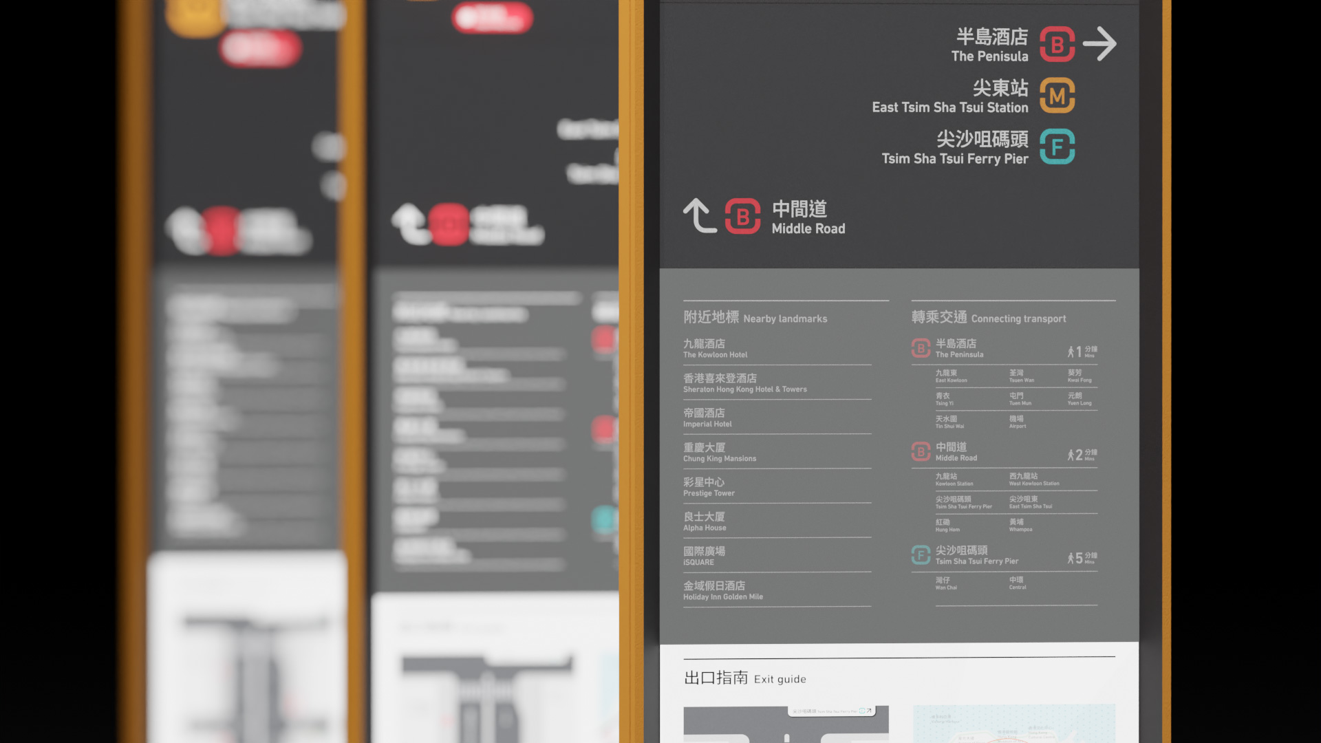
The exit guide and large identity totem are installed right next to the metro station entrances to provide further transportation information and make the entrance identifiable.
Metro station entrances are also designed with consistent visual elements of the brand and other physical signages, strengthening the brand identity while highlighting the access point.
The exit guide and large identity totem are installed right next to the metro station entrances to provide further transportation information and make the entrance identifiable.


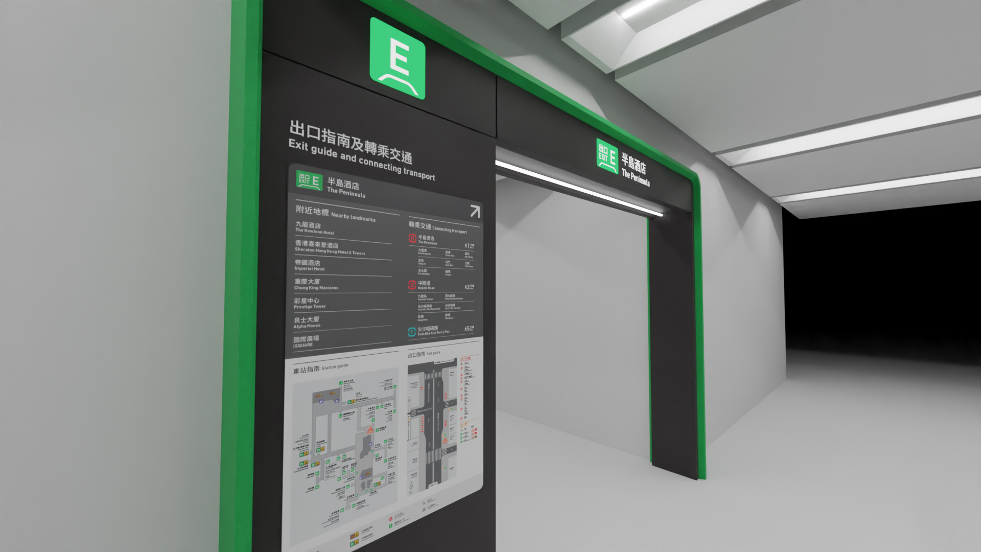
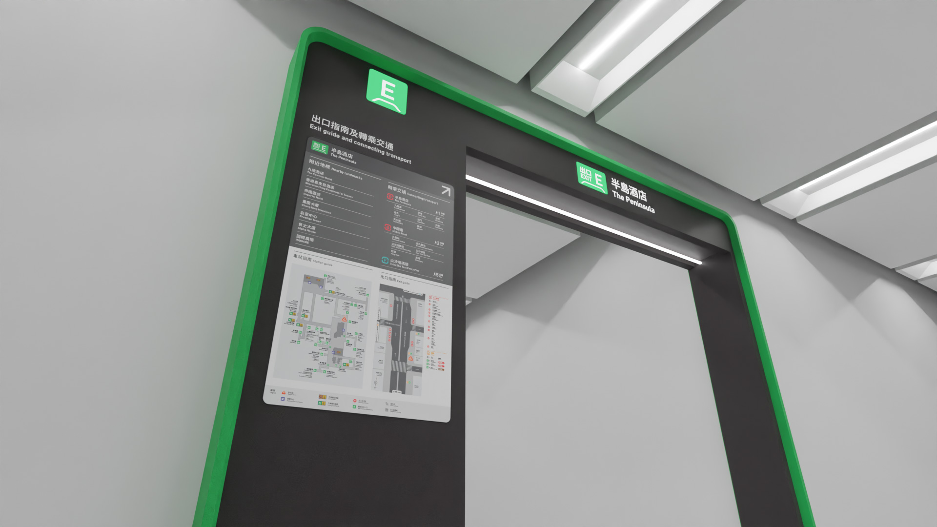
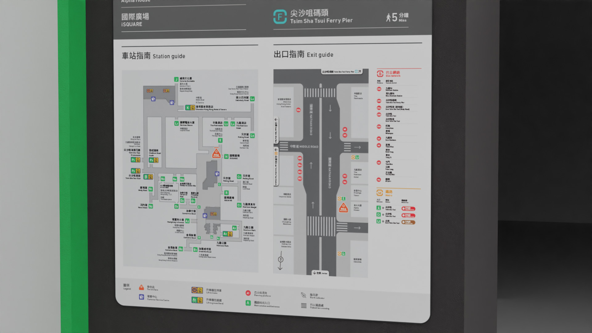

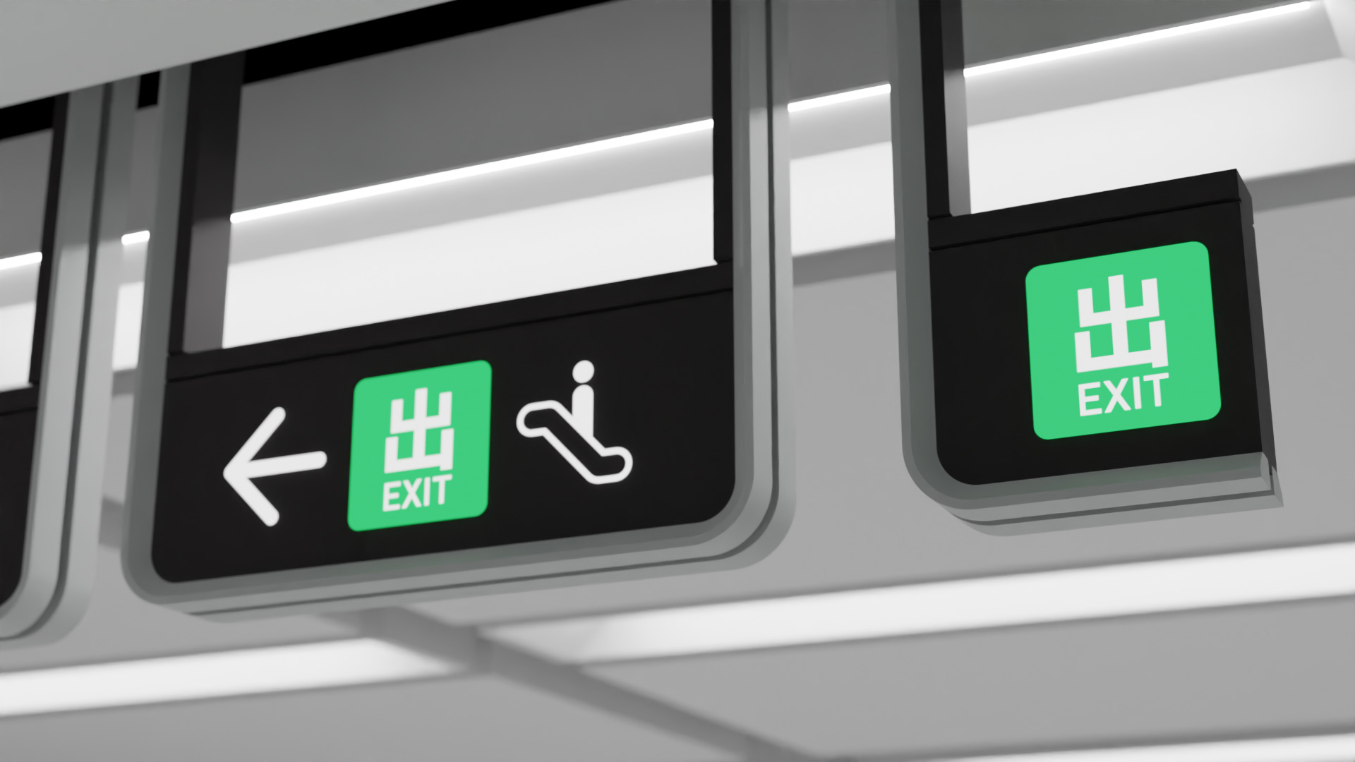
Underground metro exits portal
The underground metro station exits are designed with consistent visual elements of the brand and other physical signages.
The information set aside to further help passenger to navigate themselves.
The underground metro station exits are designed with consistent visual elements of the brand and other physical signages.
The information set aside to further help passenger to navigate themselves.


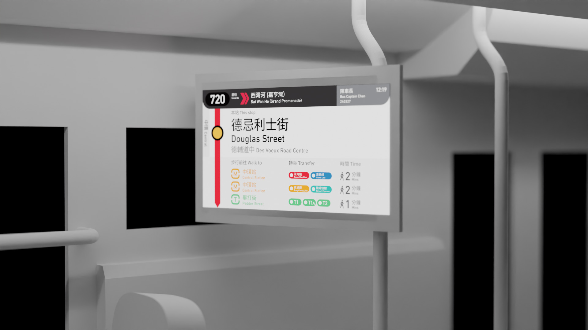
Onboard information display
In-bus information display is designed with a consistent visual style and information hierarchy which helps passengers to understand easily and without confusion.
In-bus information display is designed with a consistent visual style and information hierarchy which helps passengers to understand easily and without confusion.